 ChatGPT
 Grok
Grok
 Claude
 Perplexity
 Google AI
- 1 TL;DR
- 2 Key 2026 website design trends (quick answer)
- 3 The 50 best website design examples for 2026
- SaaS & product marketing
- AI products
- Portfolios & agencies
- E-commerce & product
- Culture, causes & experimental
- Developer tools & infrastructure
- Finance, health & services
- 4 Comparison table: which example fits your project?
- 5 How to turn any of these examples into your own site (5-step framework)
- 6 Conclusion
- 7 Frequently Asked Questions
- What makes a website design “good” in 2026?
- What are the 5 golden rules of web design?
- What is the 3-second rule in web design?
- Do I need to follow design trends to make a good website?
- What’s the difference between UI and UX design?
- Can I use an AI website builder instead of hiring a designer?
- How much does a professionally designed website cost in 2026?
- Where can I find more website design inspiration beyond this list?
TL;DR
- Good website design in 2026 balances bold visual identity with fast load times, clear hierarchy, and accessibility — not just trendy animation.
- The 50 examples below span SaaS, AI products, e-commerce, portfolios, and nonprofits, chosen for what a freelancer, student, or small team can actually learn and reuse.
- The dominant 2026 trends are: restrained motion (used with purpose, not decoration), high-contrast typography-led heroes, and AI-assisted personalization baked into the browsing experience.
- A 5-step framework at the end shows you how to turn any example here into your own homepage, whether you’re coding it by hand or using an AI website builder.
- Skip to the comparison table if you want the fastest way to match an example to your project type.
Looking at real websites is still the fastest way to get better at web design — faster than any course, because you can see exactly how professionals solve the same problems you’re facing: what goes in the hero, how much white space is too much, when to animate and when to stop. This guide collects 50 website design examples from 2025–2026, organized so you can find one that matches your project (SaaS, portfolio, e-commerce, nonprofit) in seconds, plus a repeatable framework for translating what you like into your own build.
Key 2026 website design trends (quick answer)
Before the examples: three shifts define 2026 web design specifically.
- Motion with restraint. GSAP and Framer Motion are still the dominant animation libraries, but the trend has moved from constant motion to a handful of purposeful transitions that reinforce hierarchy.
- AI-native product marketing. AI tools (Cohere, Grok, Neon, Mintlify) are now designing their own marketing sites to look as technical and fast as the product itself — dark UI, monospace accents, live data visuals.
- Typography as the entire brand. A growing number of 2026 sites (Wispr Flow, Typeform, Chargetrip) skip illustration almost entirely and let one distinctive serif or display typeface carry the whole identity.
The 50 best website design examples for 2026
Organized by category so you can jump to what’s relevant to your project. Each entry includes what to learn from it and its primary tech stack where known.
SaaS & product marketing
1. Linear
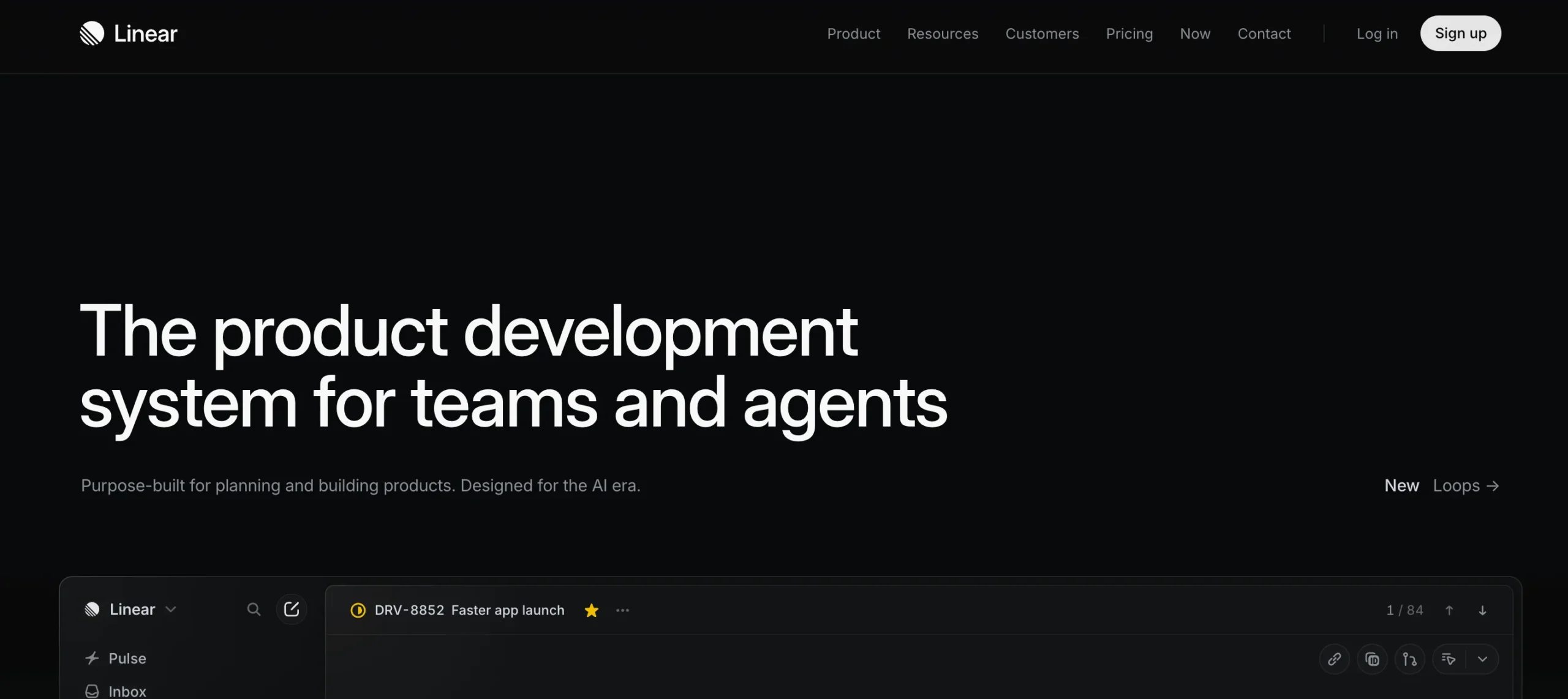
A near-perfect example of restraint: a single dark hero, one confident headline, and product screenshots that do all the persuading. Take away: cut your homepage copy in half before you add another animation.
2. Notion
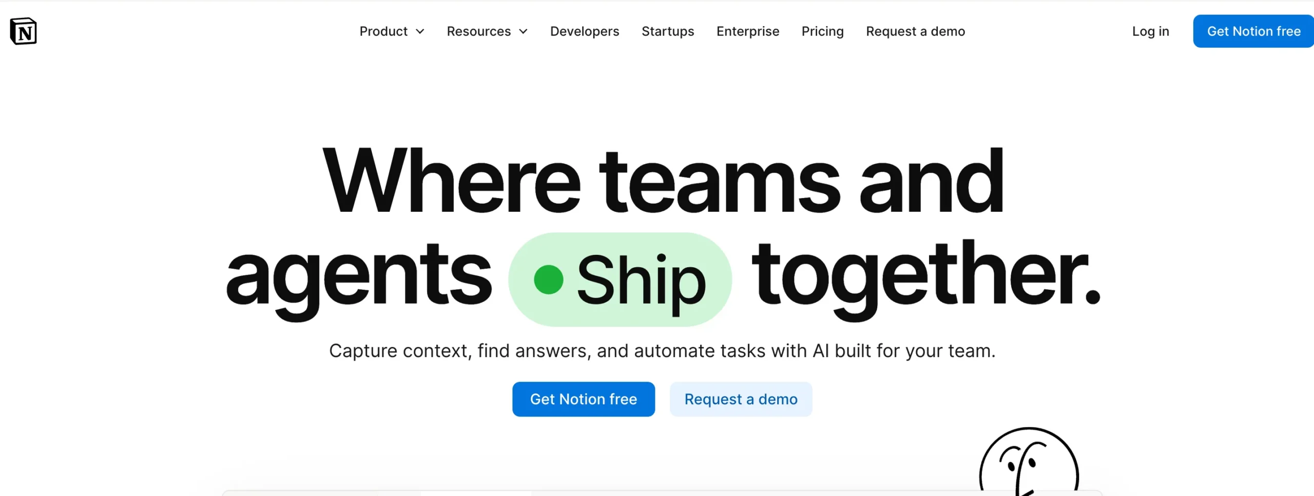
Balances a professional workspace tool with hand-drawn character illustrations, proving playful and credible aren’t opposites. Take away: one recurring illustrated motif can carry personality across dozens of pages.
3. Superhuman
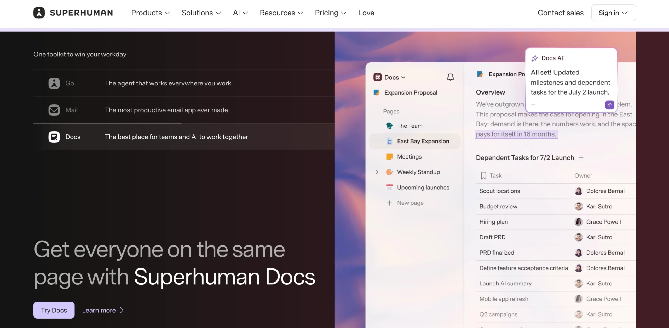
Soft gradient backgrounds and translucent floating UI cards create a calm, premium feel for a productivity tool. Take away: gradients work best when they frame content instead of competing with it.
4. Stripe
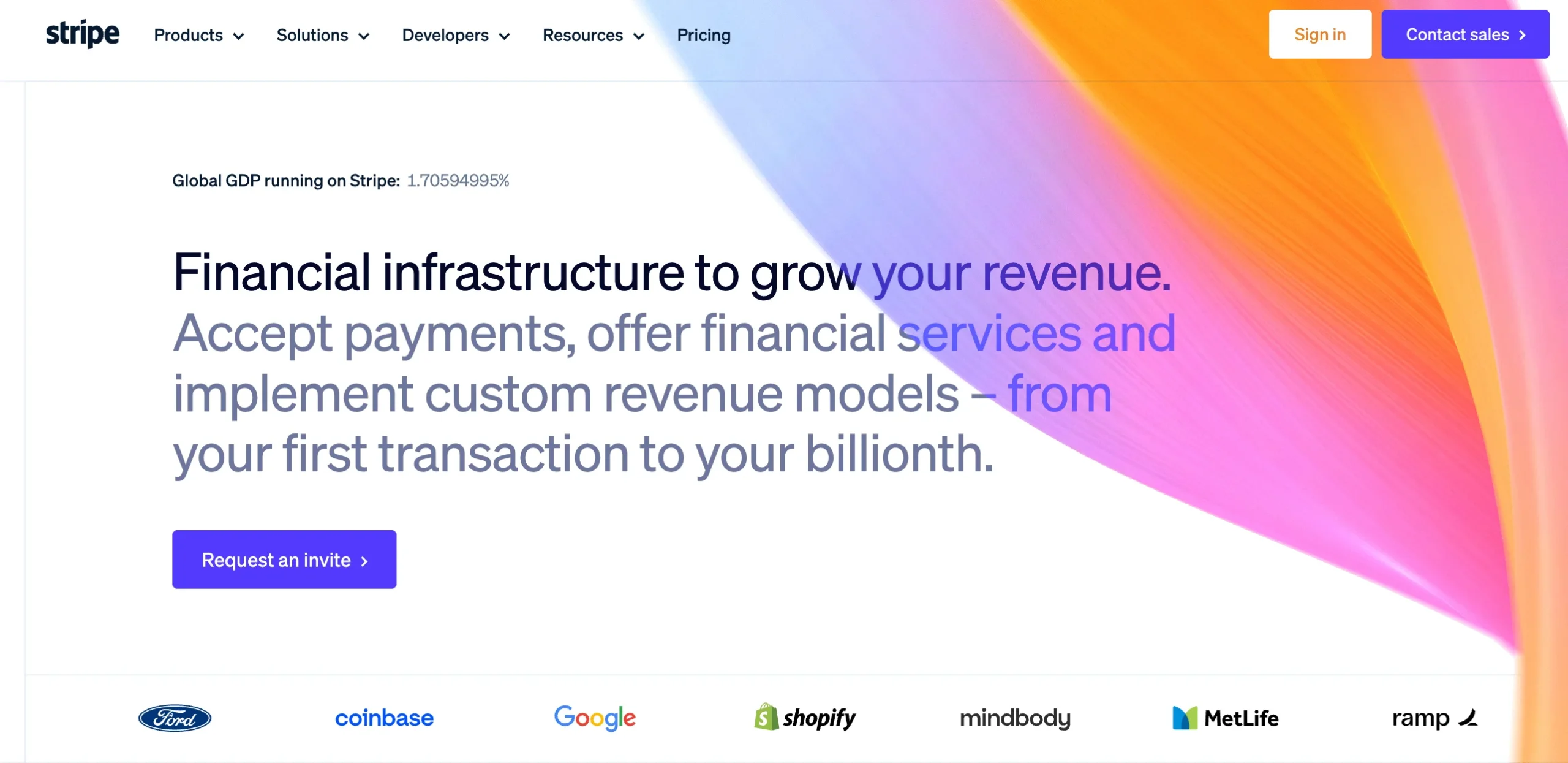
The reference standard for developer-trust design: clean documentation-style typography, real code snippets on the homepage, and zero marketing fluff. Take away: show your actual product interface, not a stock illustration of it.
5. Typeform
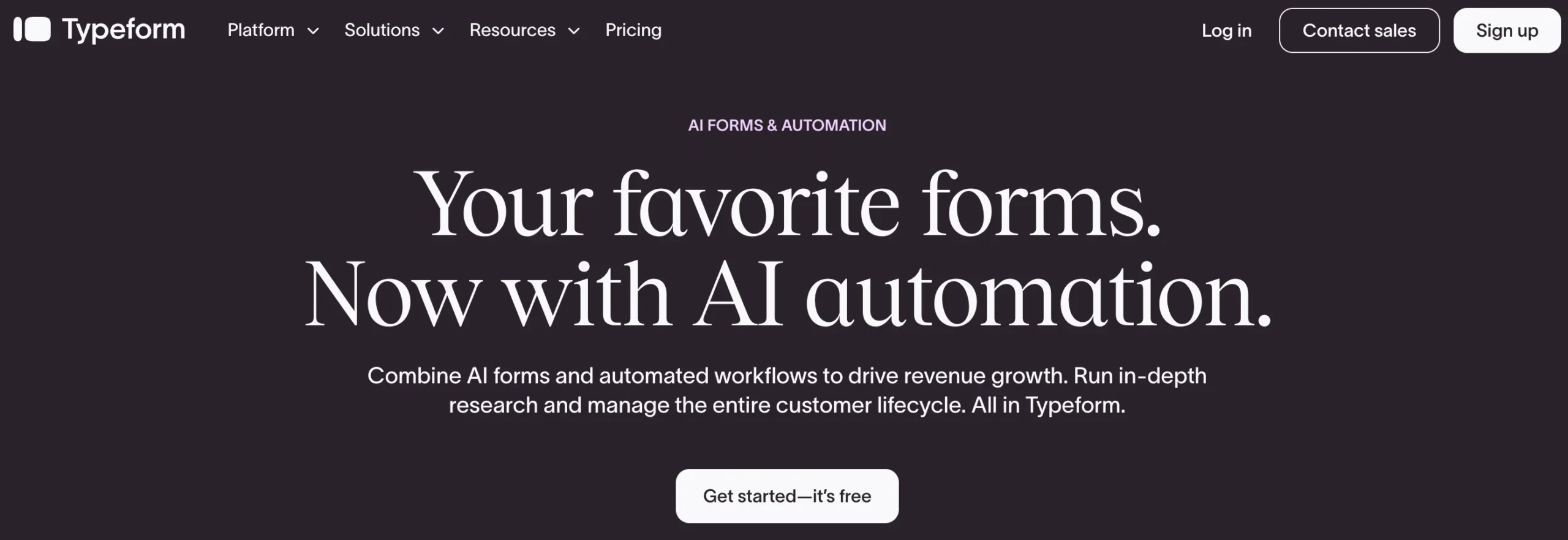
Editorial, magazine-style serif type paired with a dark, premium palette. Take away: a single oversized serif headline can make a SaaS page feel human instead of corporate.
6. Neon (Postgres)
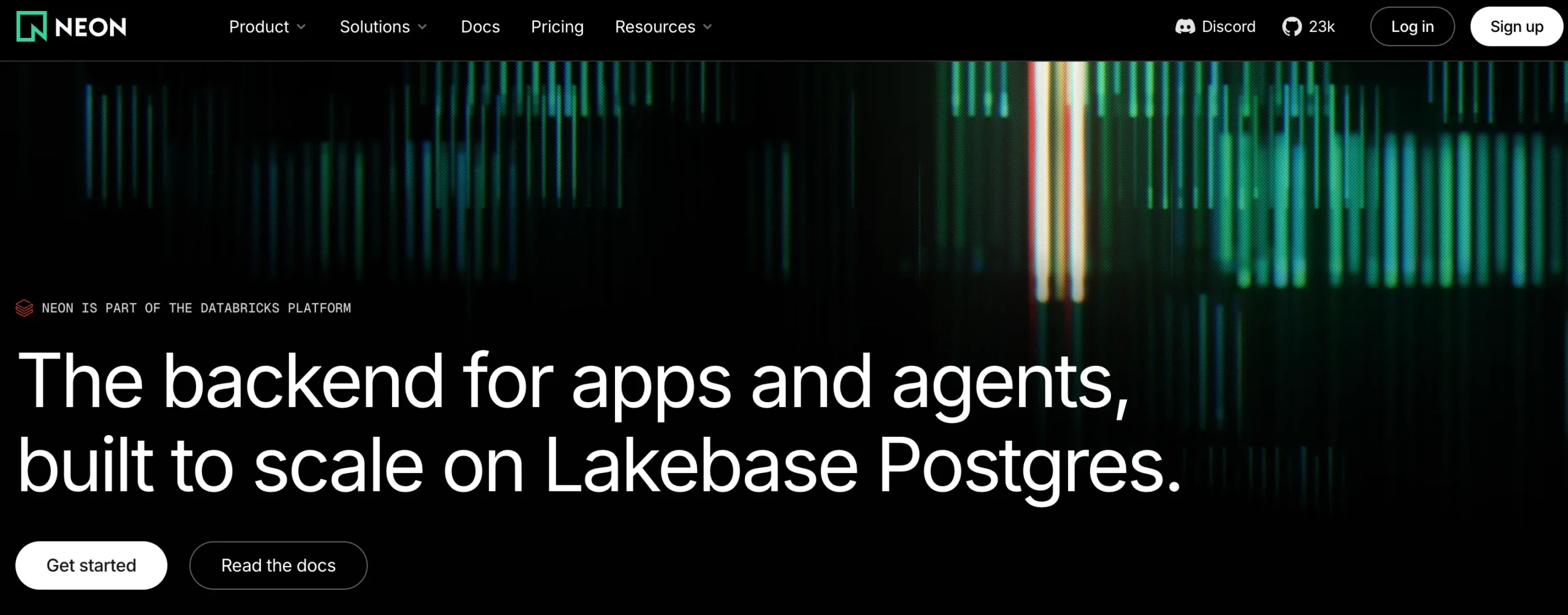
A dark, dotted, “developer console” aesthetic that mirrors the audience it’s selling to. Take away: match your visual register to your buyer — technical audiences respond to technical-looking UI.
7. Framer
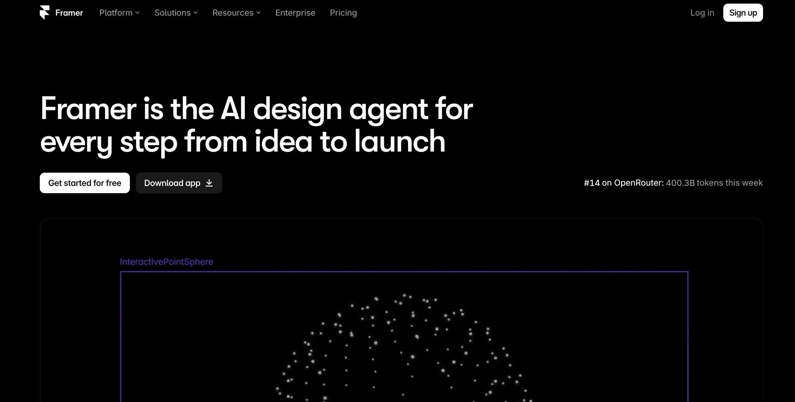
The site is also the product demo; every scroll interaction shows off what the no-code builder can do. Take away: when your product is design, let the marketing site double as the portfolio.
8. Webflow
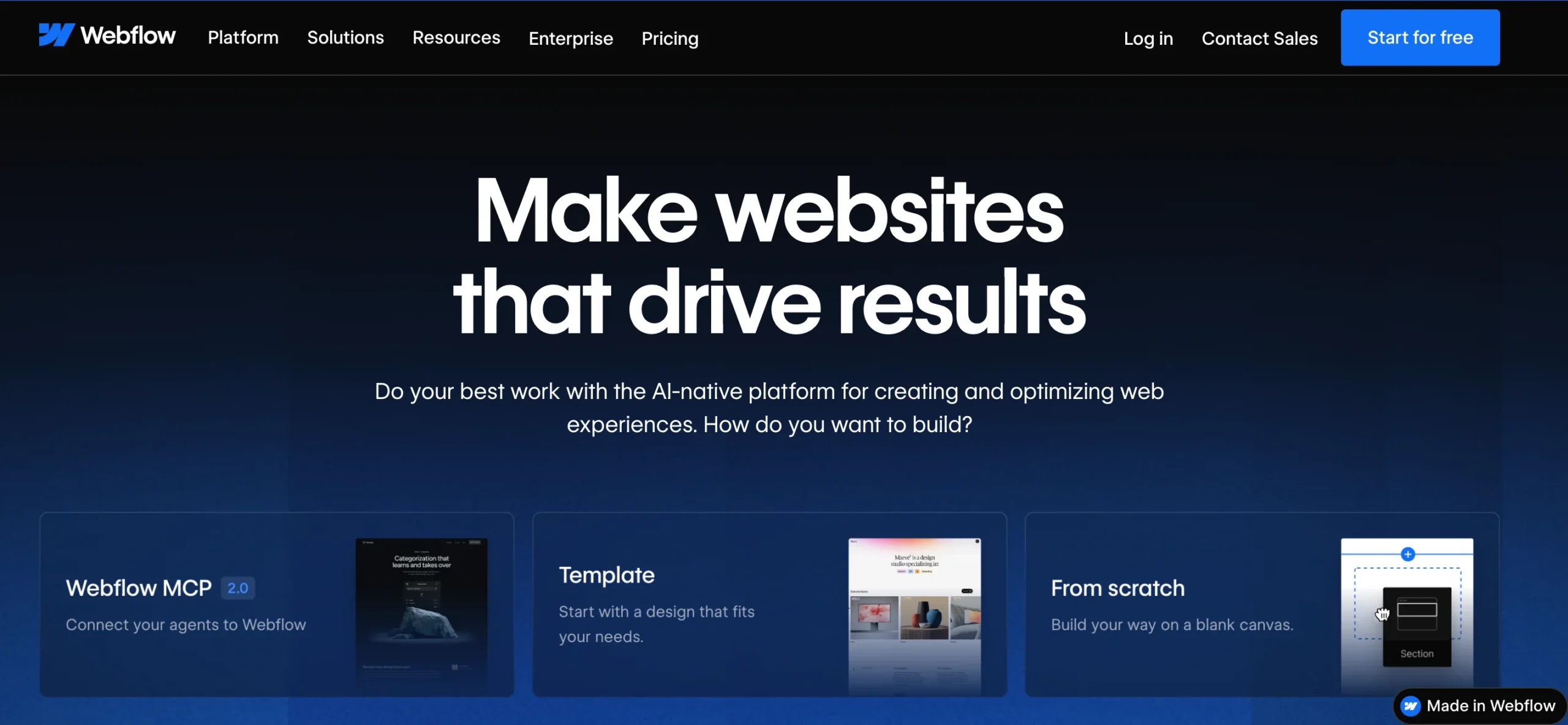
Long-standing benchmark for structured, grid-based SaaS marketing with clear tiered pricing pages. Take away: predictable structure builds trust for tools people will pay for monthly.
9. Mintlify
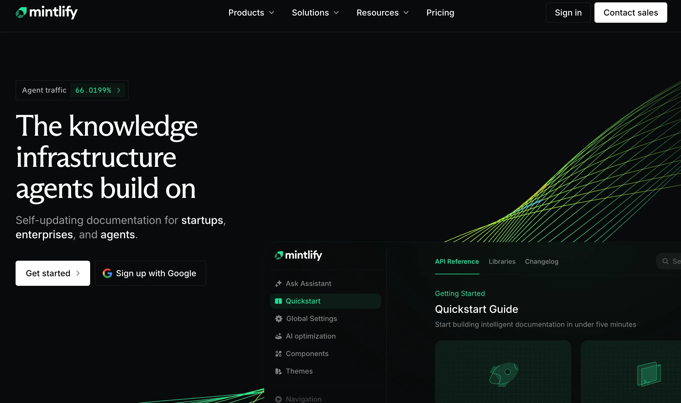
Aurora-style gradients over a dark documentation UI make technical docs feel modern rather than dry. Take away: even “boring” categories like docs benefit from one signature visual motif.
10. Gamma
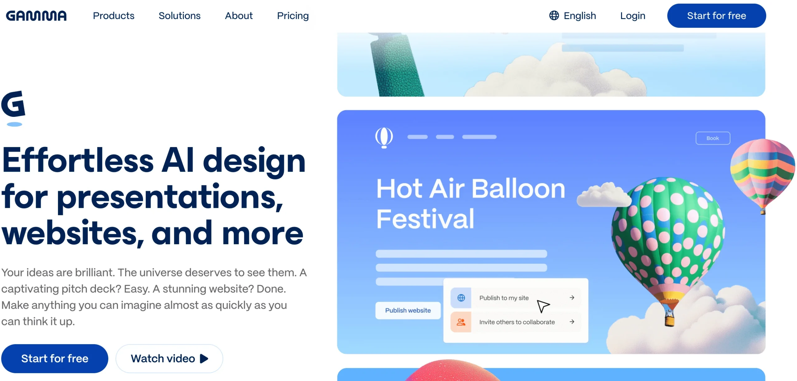
Bold split-screen layout: dense typography on one side, vivid 3D illustration on the other. Take away: split layouts let you say a lot of text without it feeling heavy.
11. Evervault
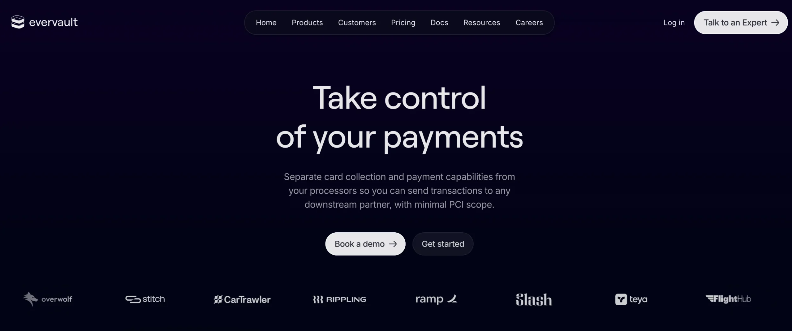
Encrypted-text animation and a black-to-purple gradient instantly signal “security” without a single lock icon. Take away: motion can explain a feature, not just decorate the page.
12. Huly
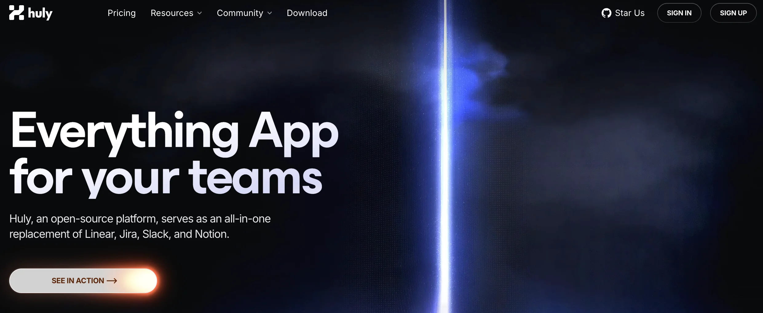
Neon, sci-fi productivity dashboard aesthetic that holds up cleanly on mobile. Take away: test your boldest visual choices on a small screen before you ship them.
13. Appwrite
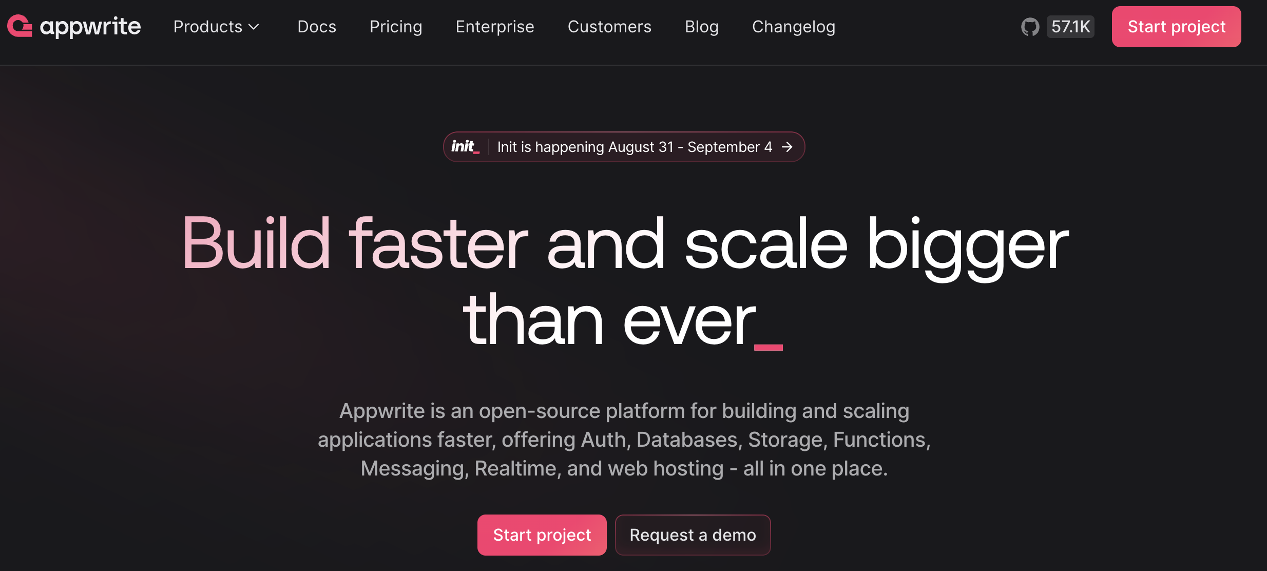
Displays its GitHub star count prominently as social proof for a developer tool. Take away: borrow credibility signals from wherever your audience already trusts (GitHub, review sites, case studies).
14. Crisp
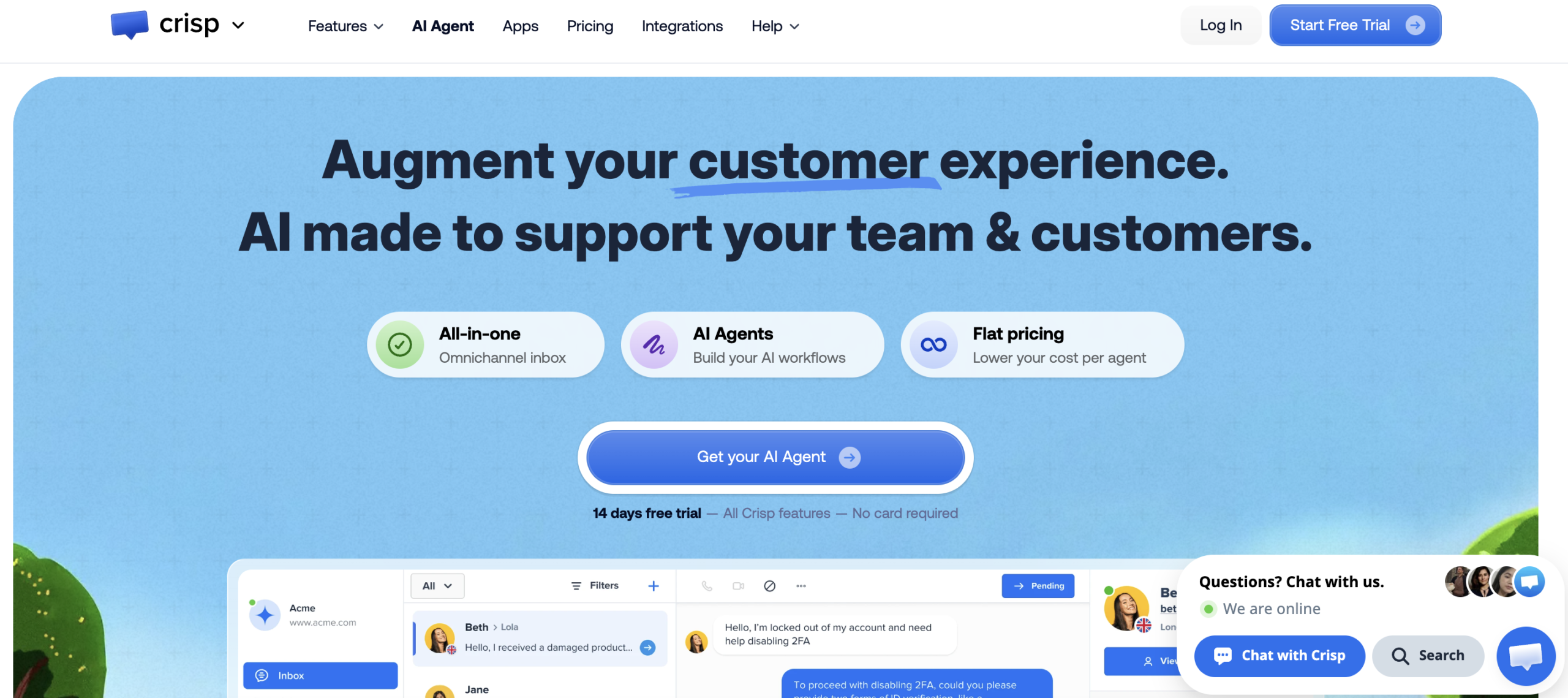
Playful illustrations and rounded UI soften what could be a dry “customer support software” pitch. Take away: friendliness is a differentiator in commoditized SaaS categories.
15. Lattice
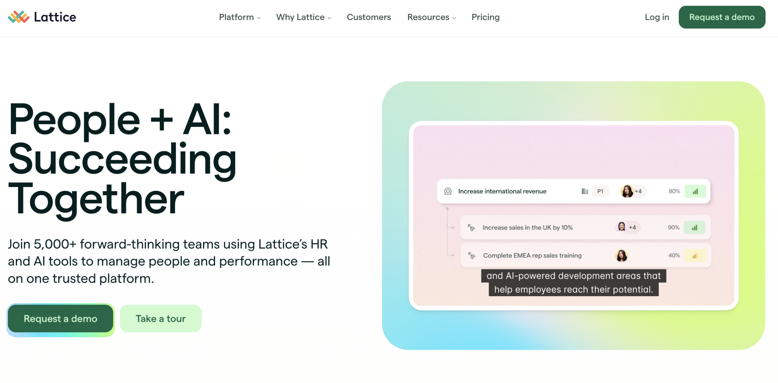
Pastel, human-centered palette makes HR software feel supportive instead of corporate. Take away: color temperature alone can shift how “corporate” your brand feels.
Explore: Best Smartphones Under $500 in 2026: Top 8 Ranked & Compared
AI products
16. Cohere
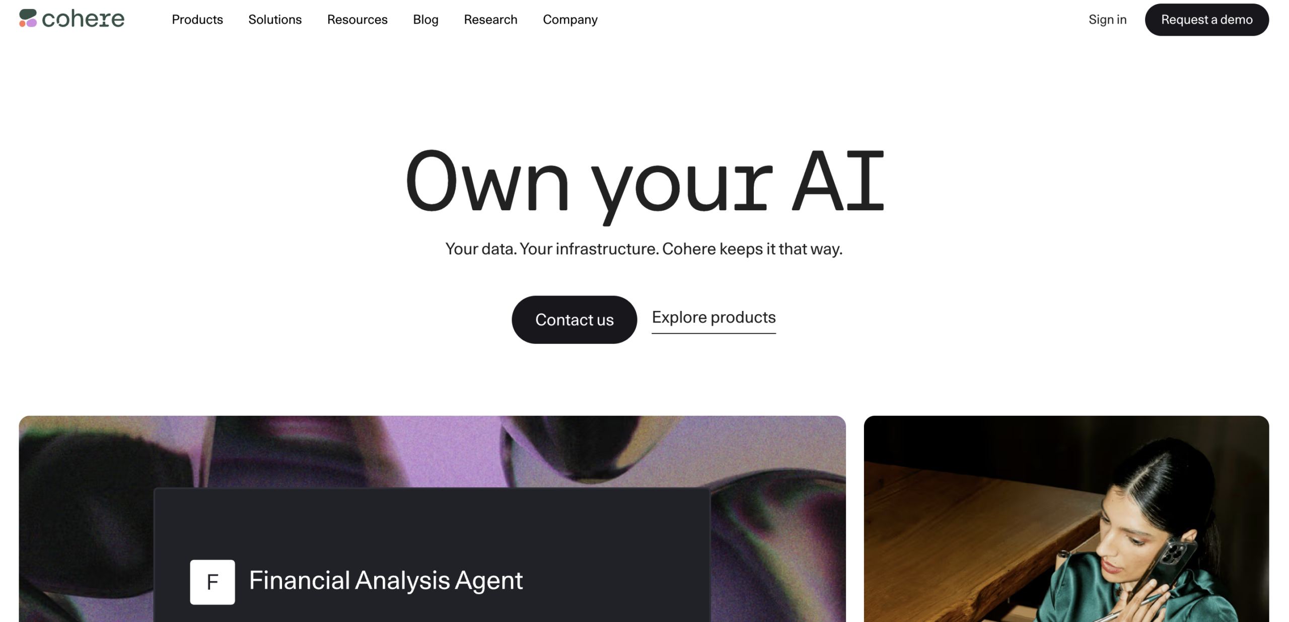
Clean, gradient-led hero with generous whitespace that keeps a technically complex AI product approachable. Take away: whitespace does more to signal “premium” than any single visual flourish.
17. Grok (xAI)
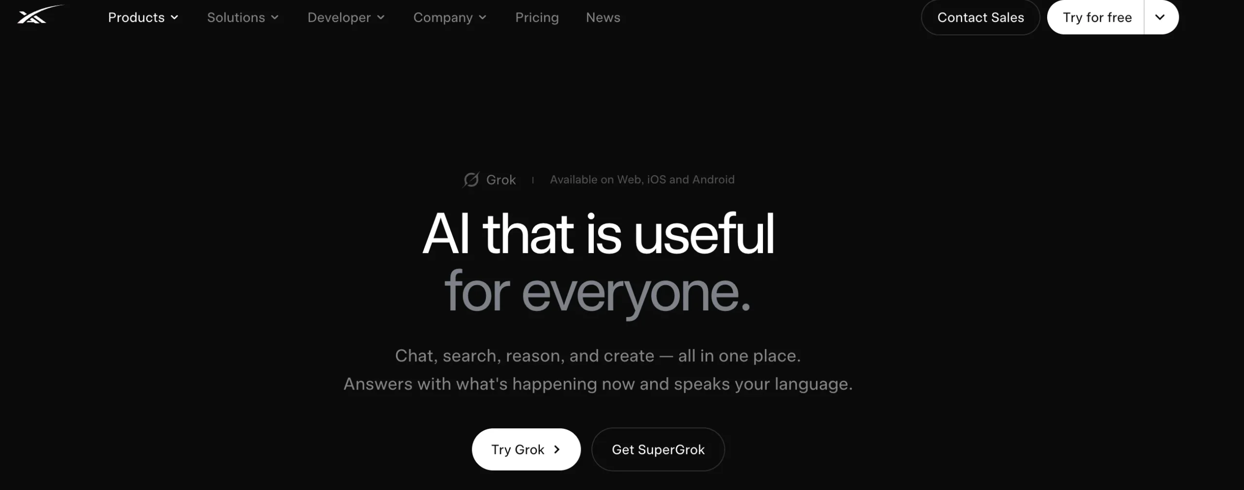
Cinematic dark hero with glowing energy effects and oversized wordmark typography. Take away: one dramatic hero moment can carry an entire brand if everything after it stays simple.
18. Synthesia
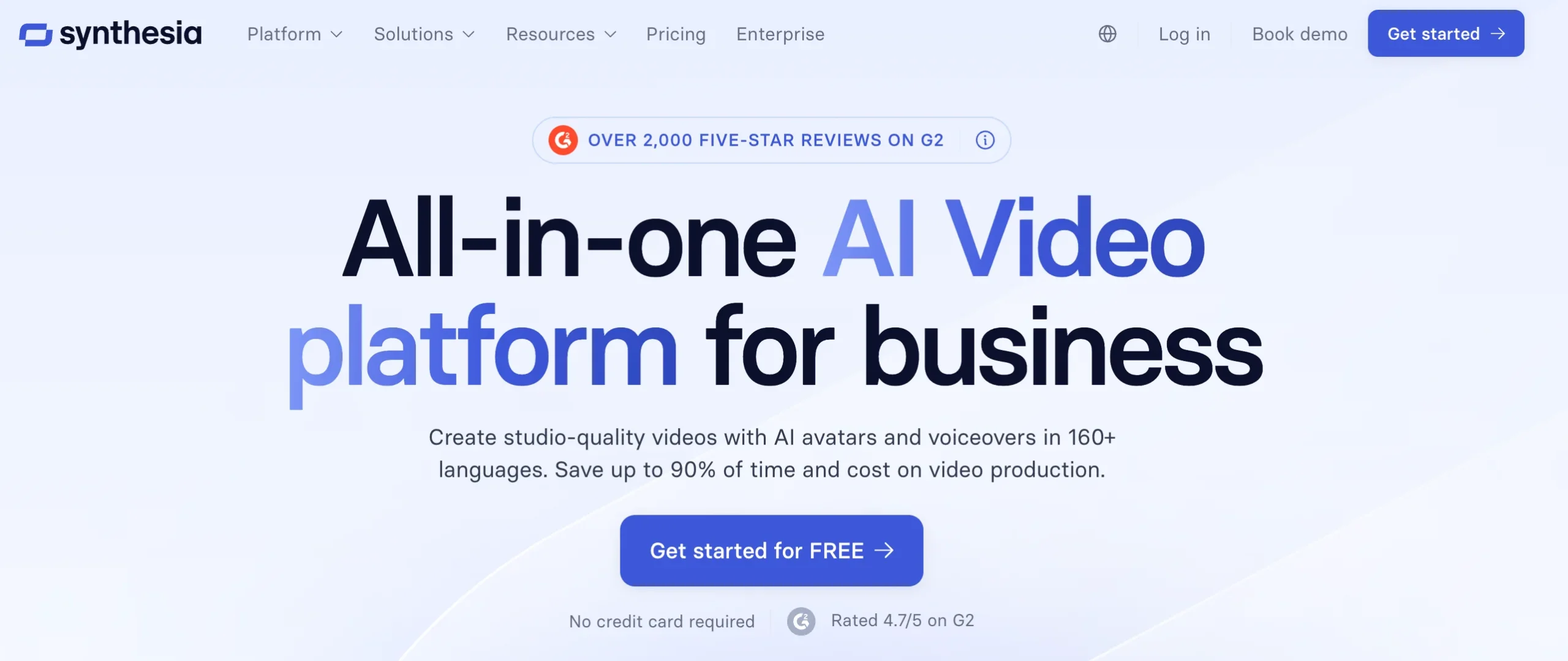
Soft blue gradients and a single strong CTA keep an AI video tool’s homepage fast to scan. Take away: one CTA, repeated, converts better than five competing buttons.
19. Tavus
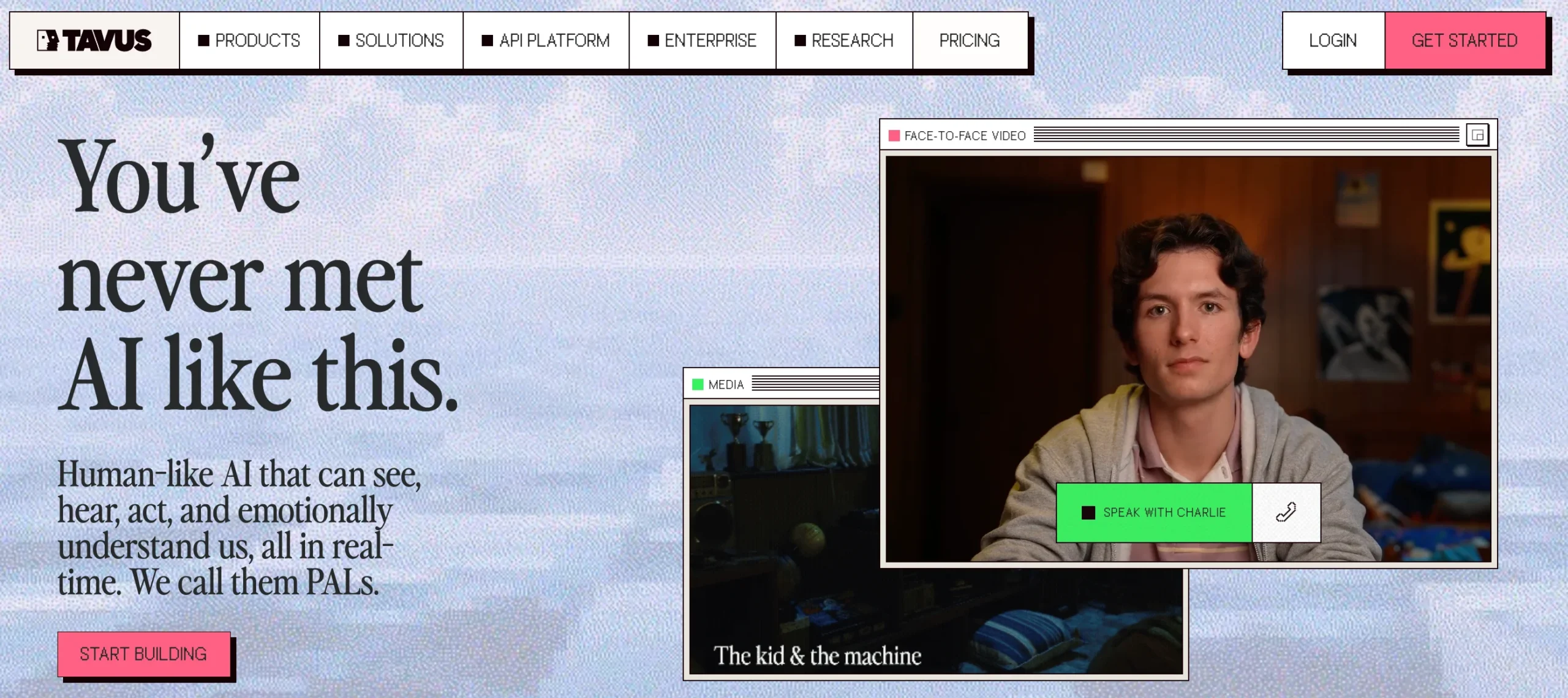
Retro pixel-texture and stacked “video call” windows give an AI avatar company real personality. Take away: a slightly imperfect, textured aesthetic can stand out against a sea of clean gradients.
20. Perplexity
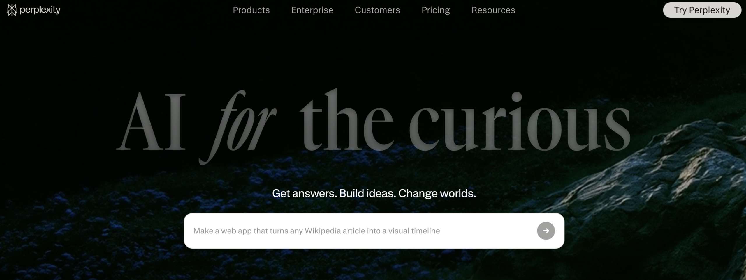
Search-bar-first homepage that mirrors the product experience from the very first second. Take away: if your product is an input box, make the input box the hero, not an afterthought.
21. ElevenLabs
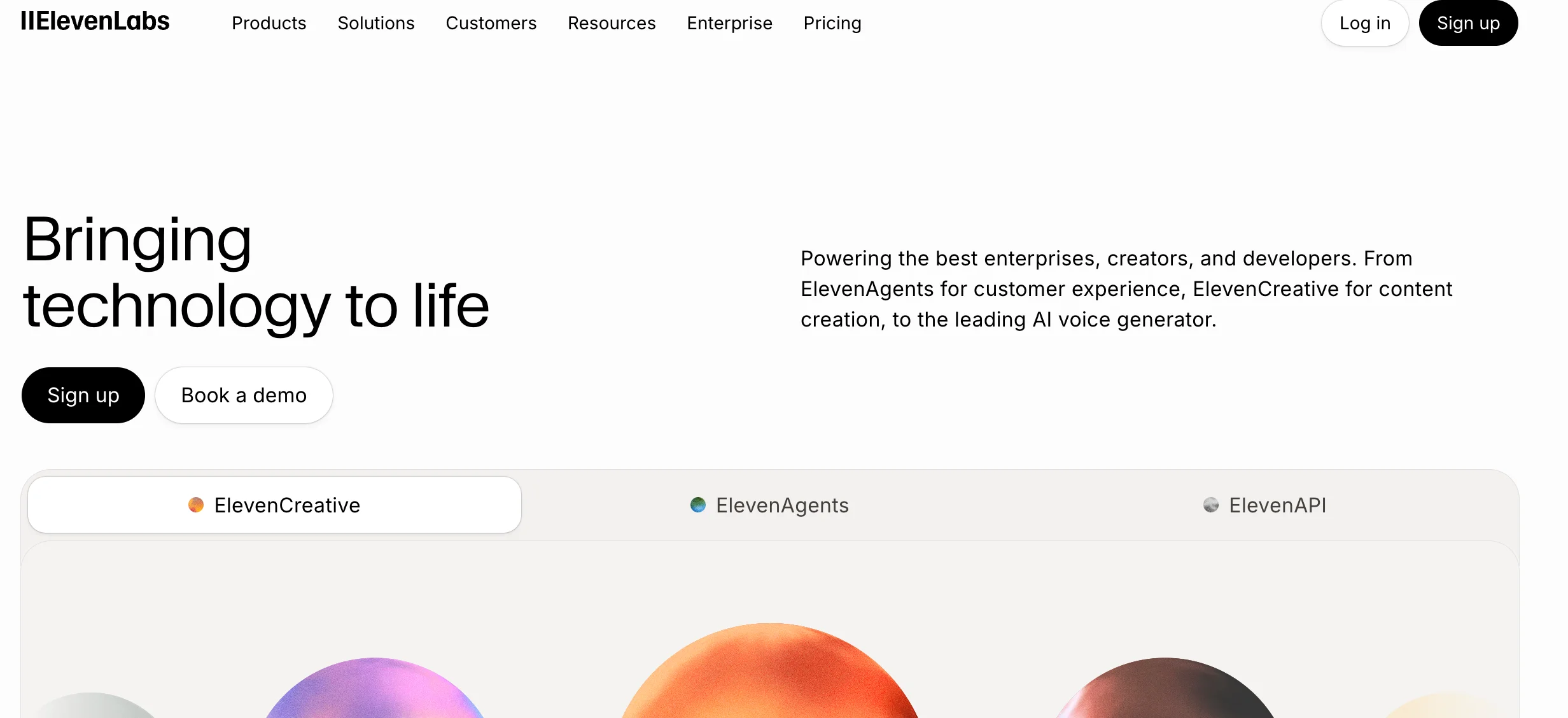
Minimal, audio-waveform-driven visuals that let the product’s own output (voice) be the design element. Take away: use your product’s actual output as your homepage’s visual asset.
22. Cluely
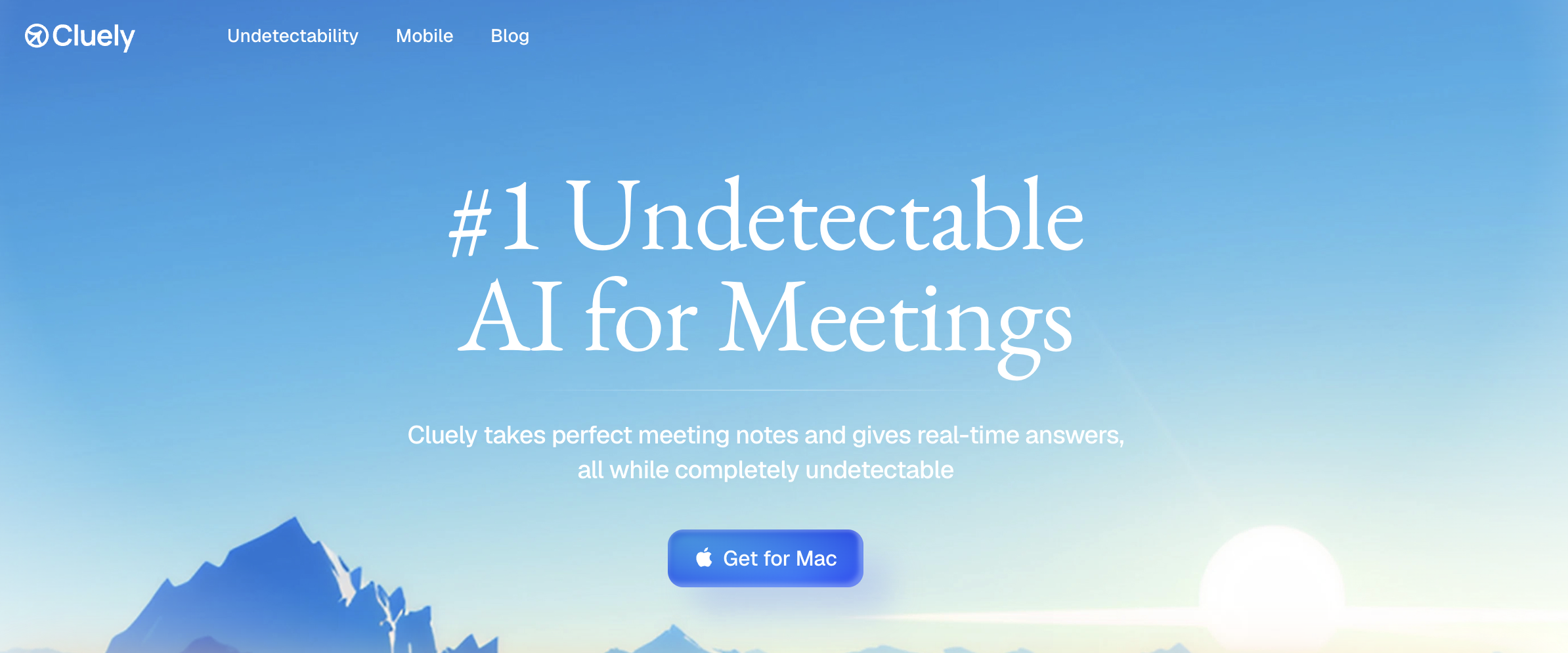
Airy blue gradient with layered, rounded product mockups for a lightweight, optimistic feel. Take away: soft shadows on stacked mockups are an easy way to add depth without extra design work.
23. Chutes
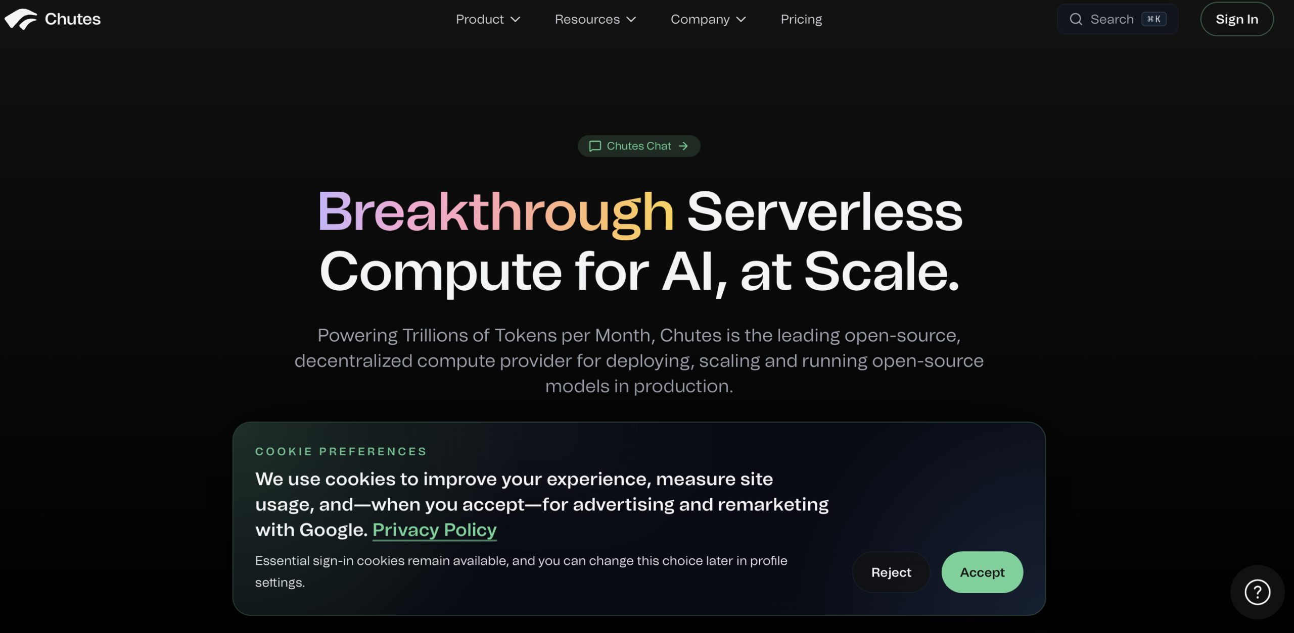
Multicolor gradient typography paired with a glowing 3D object to signal “compute power.” Take away: a single 3D centerpiece can replace pages of technical explanation.
24. Amzigo
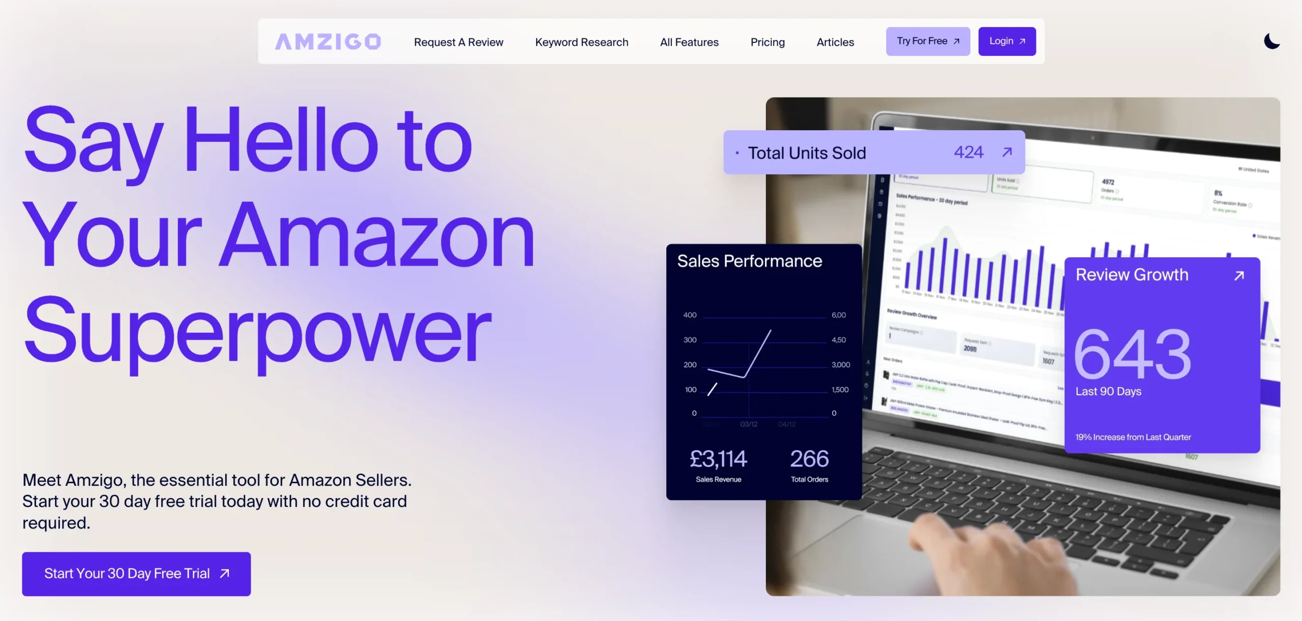
Oversized hero type plus floating analytics cards on a purple-glow dashboard preview. Take away: floating metric cards are a fast way to make a dashboard product feel alive on a static page.
Discover: Best Ahrefs Alternatives in 2026 (Ranked, Compared & AI-Search Ready)
Portfolios & agencies
25. Lusion
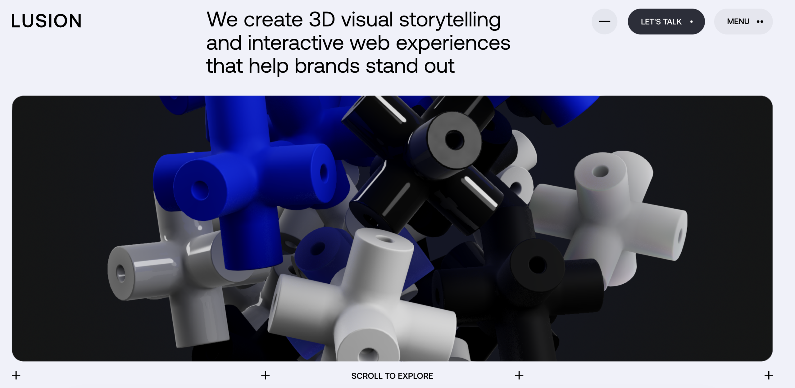
Immersive, real-time 3D visuals that function as a living portfolio piece for a creative studio. Take away: your portfolio homepage can be the best case study, not just link to one.
26. Tiny Wins
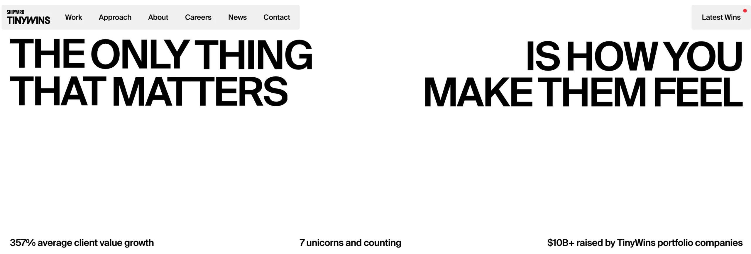
High-contrast black-and-white base with selective pink accents and case studies front and center. Take away: lead with client logos and results before you lead with your own bio.
27. Depo Studio

Modular, tile-based grid layout that shifts dynamically on scroll, including a branded 404 page. Take away: don’t neglect error pages — they’re a free opportunity to reinforce brand personality.
28. Overrrides
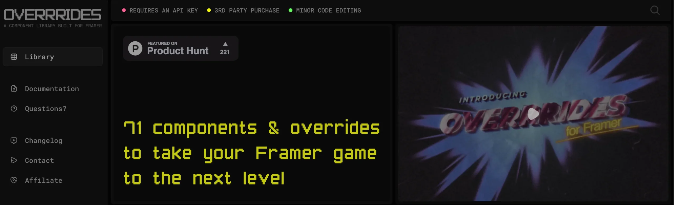
Retro terminal aesthetic with fully interactive component demos instead of static screenshots. Take away: let visitors use a piece of your product before they ever click “sign up.”
29. OSMO
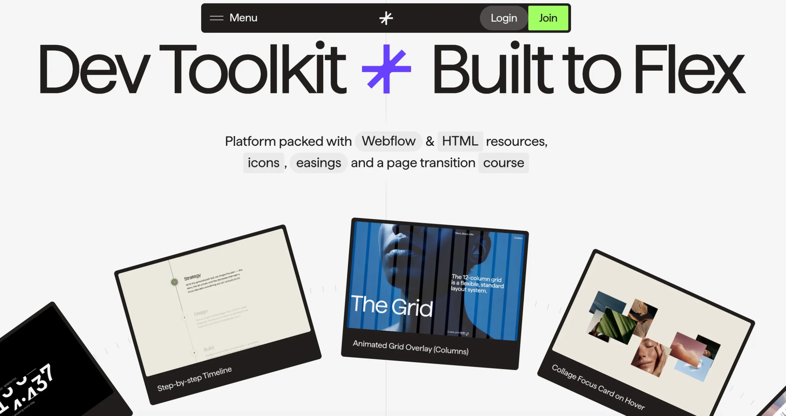
Oversized typography and neon-green accents built specifically for a developer-tool audience. Take away: pick one accent color and use it exclusively for interactive elements so CTAs never get lost.
30. Affinity Studio
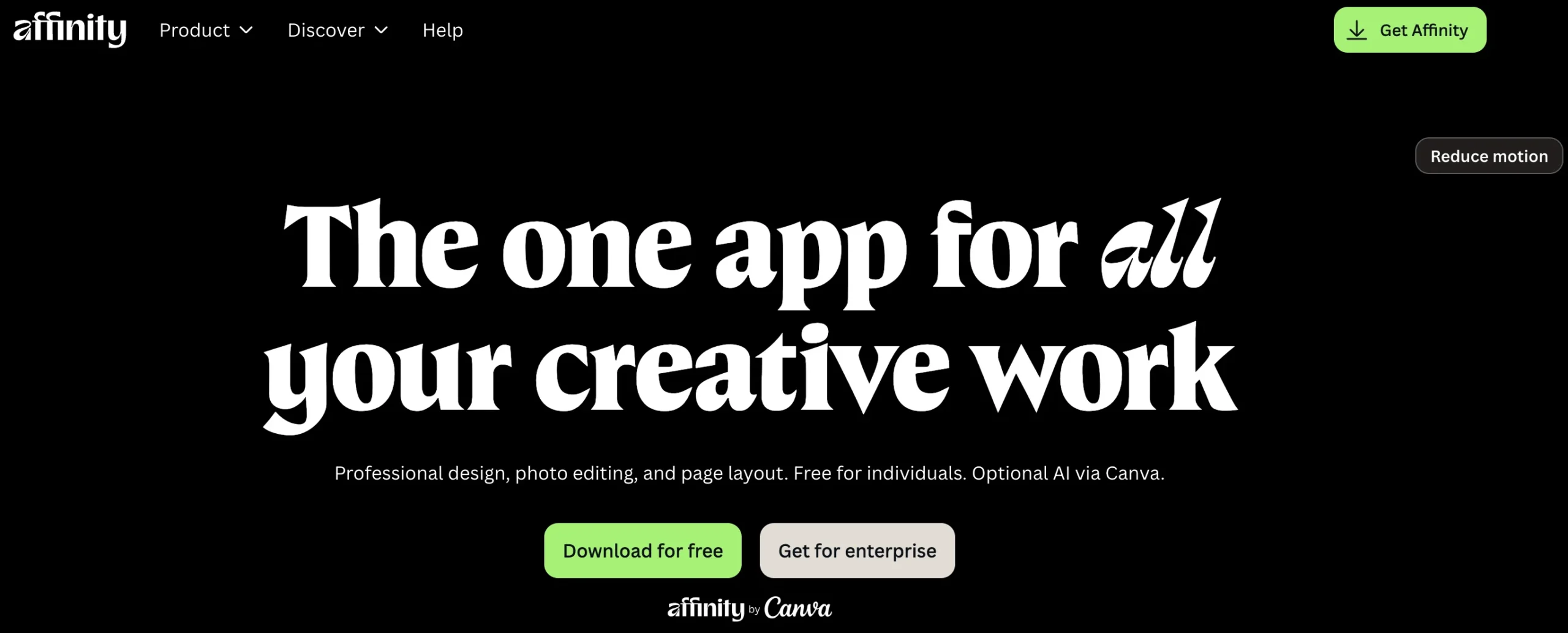
Full-black “gallery” background with museum-style serif type spotlighting client artwork. Take away: a dark, quiet background is often the best way to make colorful work samples pop.
Also Read: 53 Free AI Tools With No Sign-Up Required (2026)
E-commerce & product
31. Pebble Life
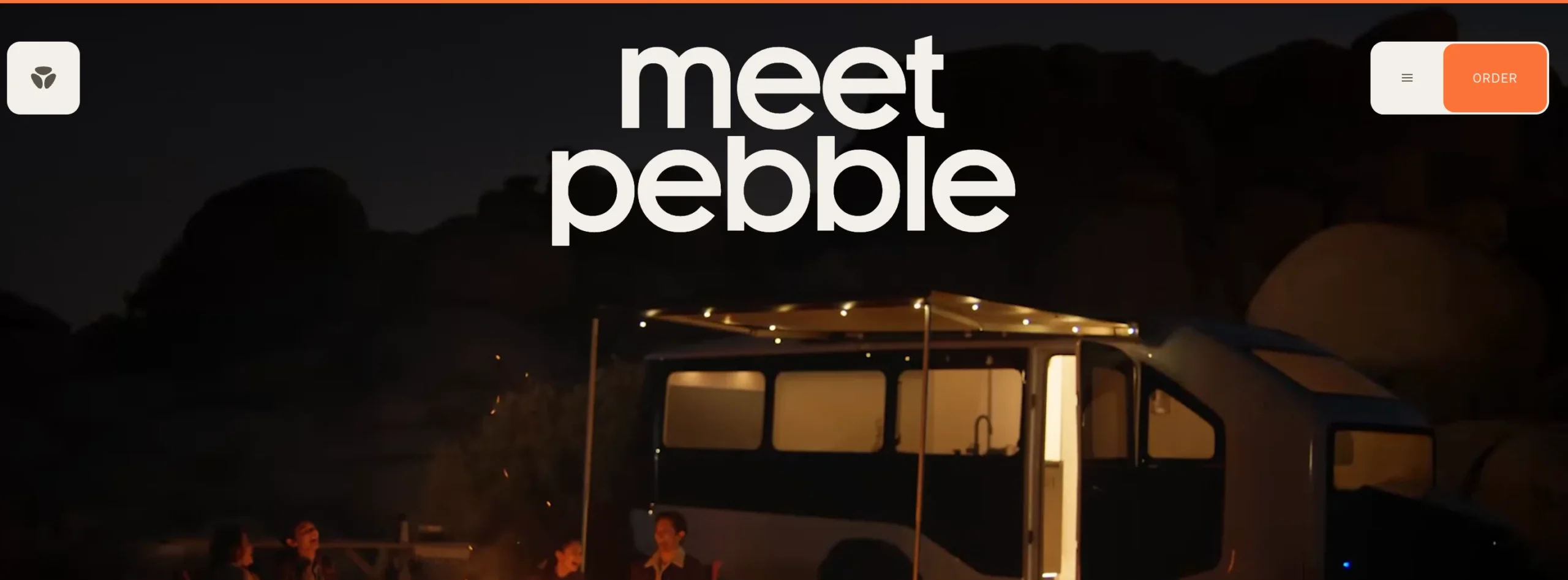
Full-screen cinematic video hero establishes a premium, adventure-brand feel before any copy loads. Take away: video backgrounds work best when they’re short, silent, and purposeful.
32. Koffiracha
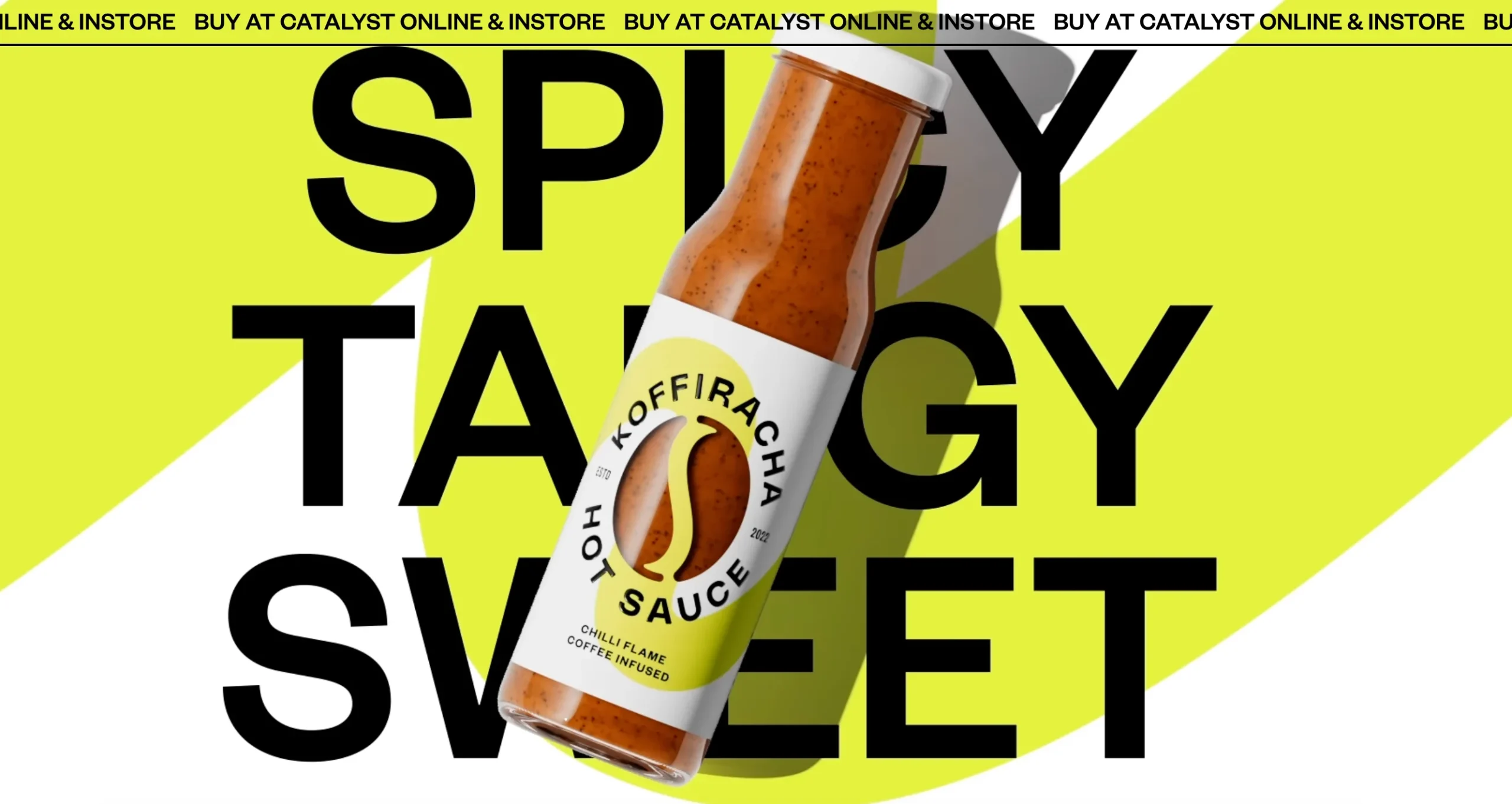
Maximalist, oversized typography with a rotating product bottle that stays the visual anchor throughout. Take away: no matter how loud your design gets, keep one element (usually the product) perfectly still and clear.
33. Noon
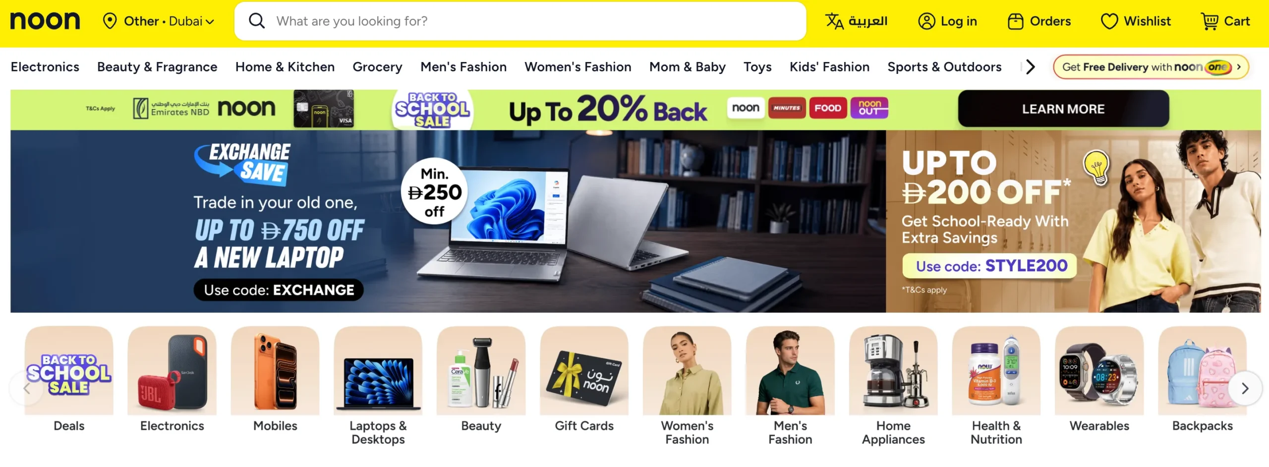
Macro photography and earthy tones create a “science-backed but natural” premium feel. Take away: photography style alone can position a product as either mass-market or premium.
34. Gemnote
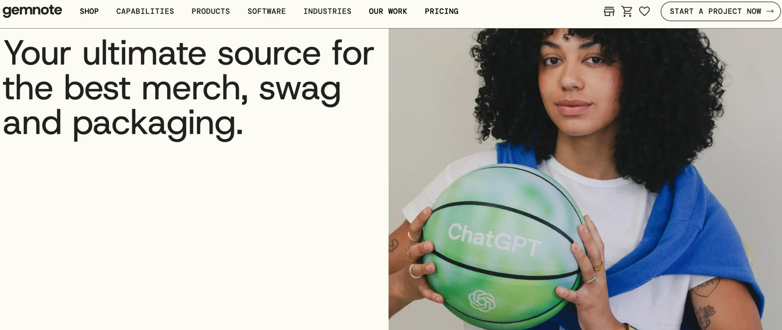
Organic, wavy image frames and cream backgrounds give an e-commerce brand a vintage, editorial warmth. Take away: irregular framing breaks the monotony of a standard product grid.
35. Quite Nice
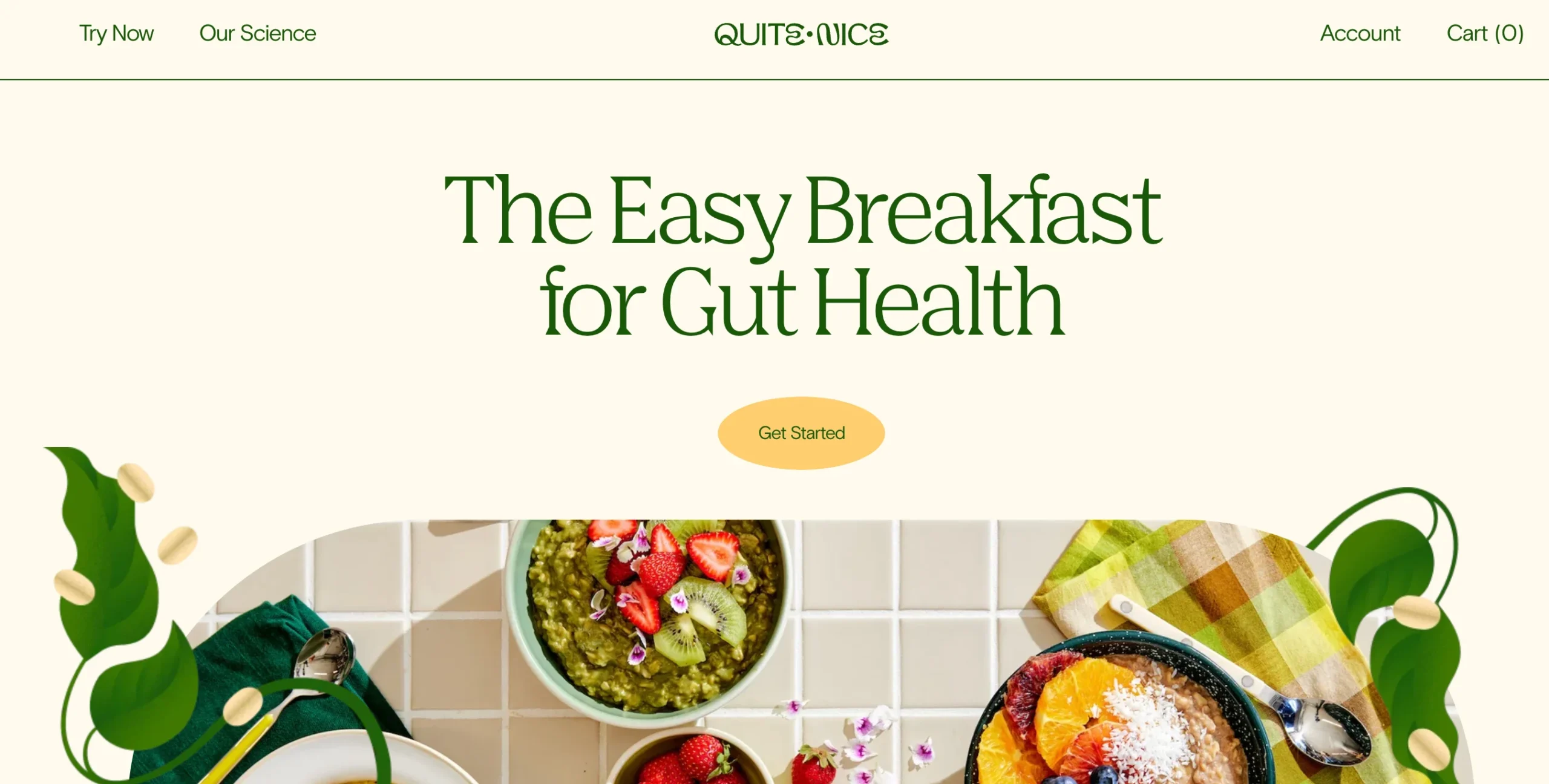
Sunlit, overhead food photography paired with a calming cream background builds appetite and trust simultaneously. Take away: natural lighting in product photography often outperforms studio-perfect shots for food and wellness brands.
36. B-Egg Farm
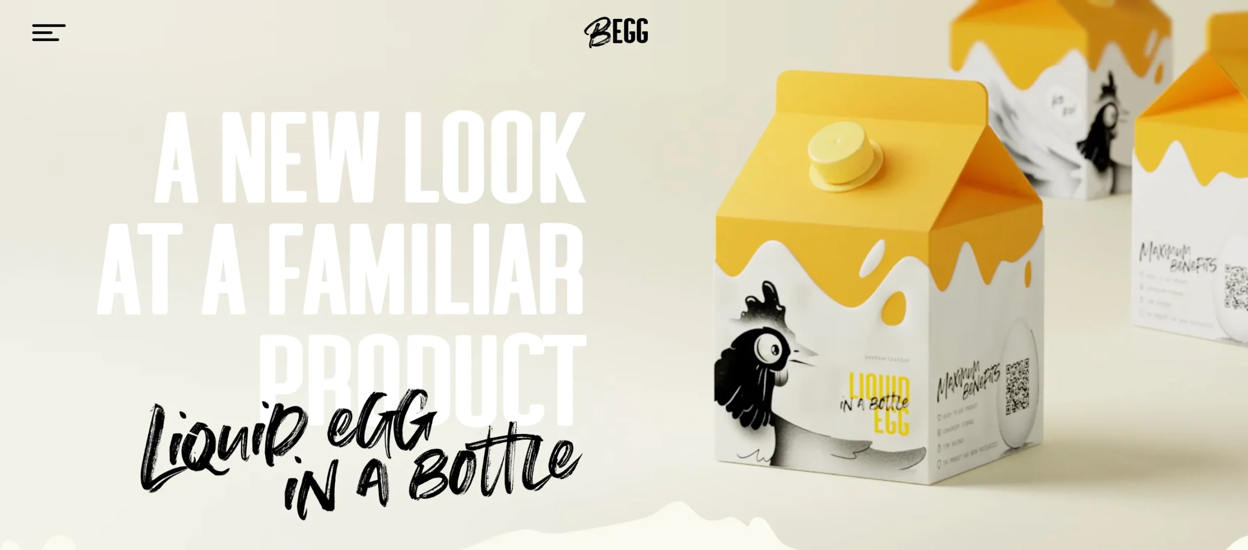
Playful hand-drawn illustrations and a packaging-matched color scheme unify physical and digital branding. Take away: your website’s color palette should be lifted directly from your packaging or physical product, not chosen separately.
You Might Like: How to Optimize Content for AI Search: The 2026 GEO/AEO Guide
Culture, causes & experimental
37. UNITED24 Rebuild Map
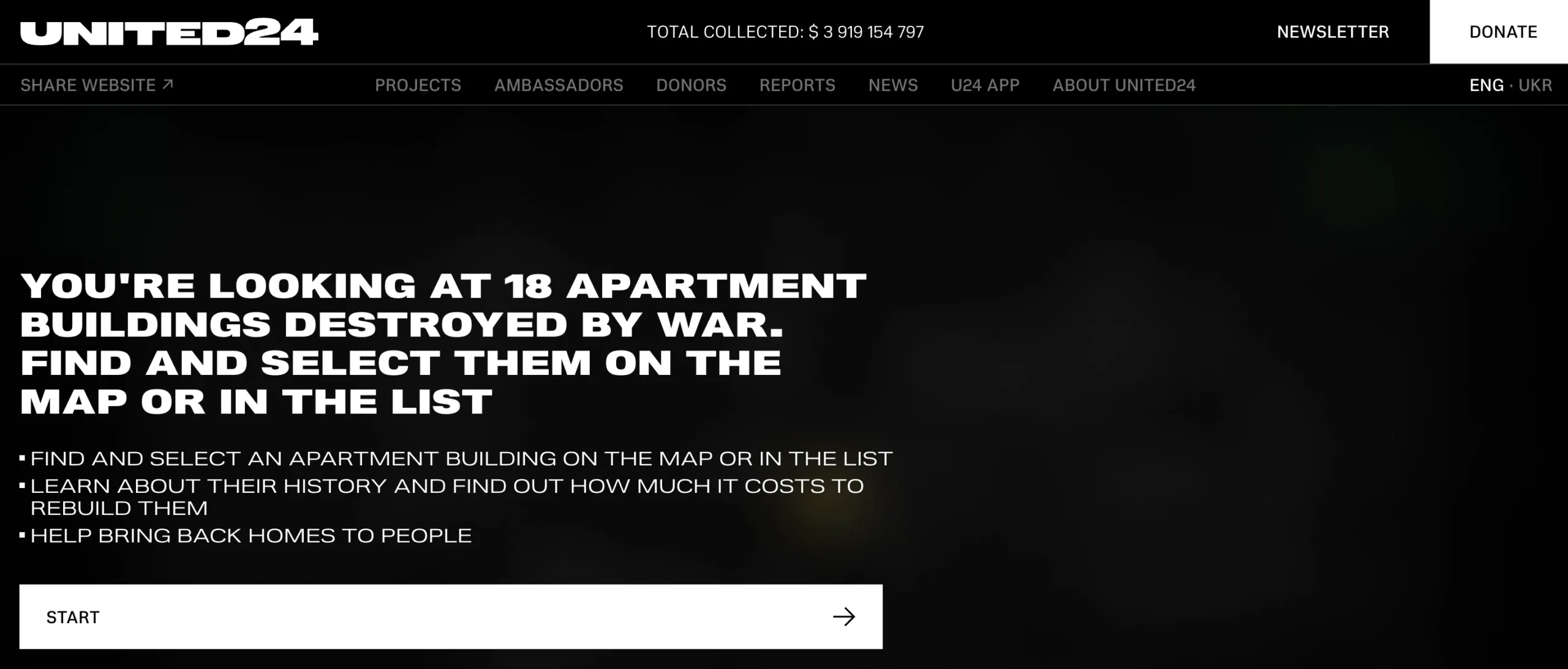
Dark, high-contrast UI with live data visualization for transparency and trust in a donation platform. Take away: real-time data, even simple counters, builds more credibility than static claims.
38. GRIDS (Obys Agency)
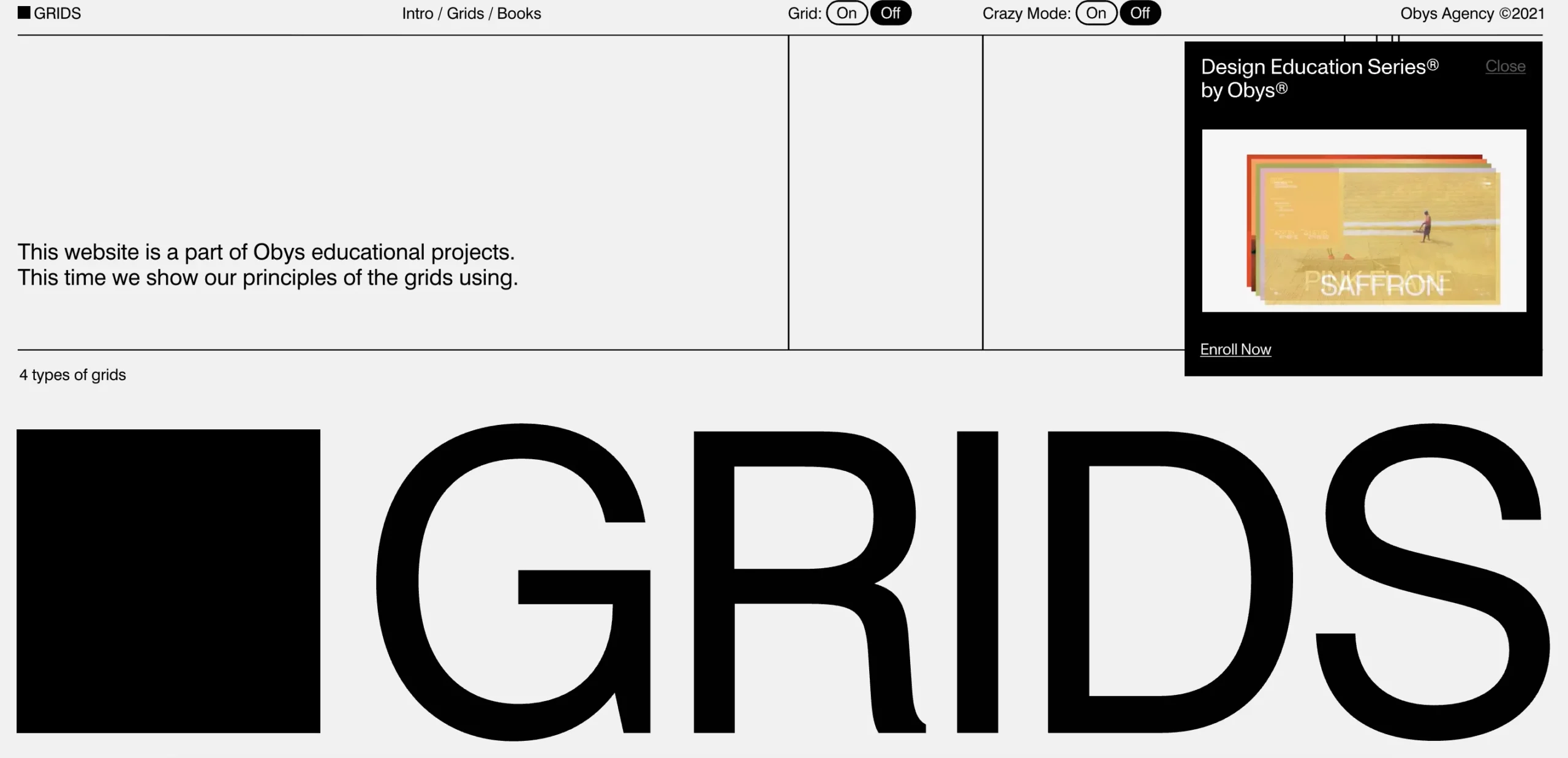
An interactive teaching tool that lets visitors toggle grid systems on and off to see composition principles in action. Take away: turning your expertise into an interactive demo earns more shares than a blog post saying the same thing.
39. Can’t Unsee
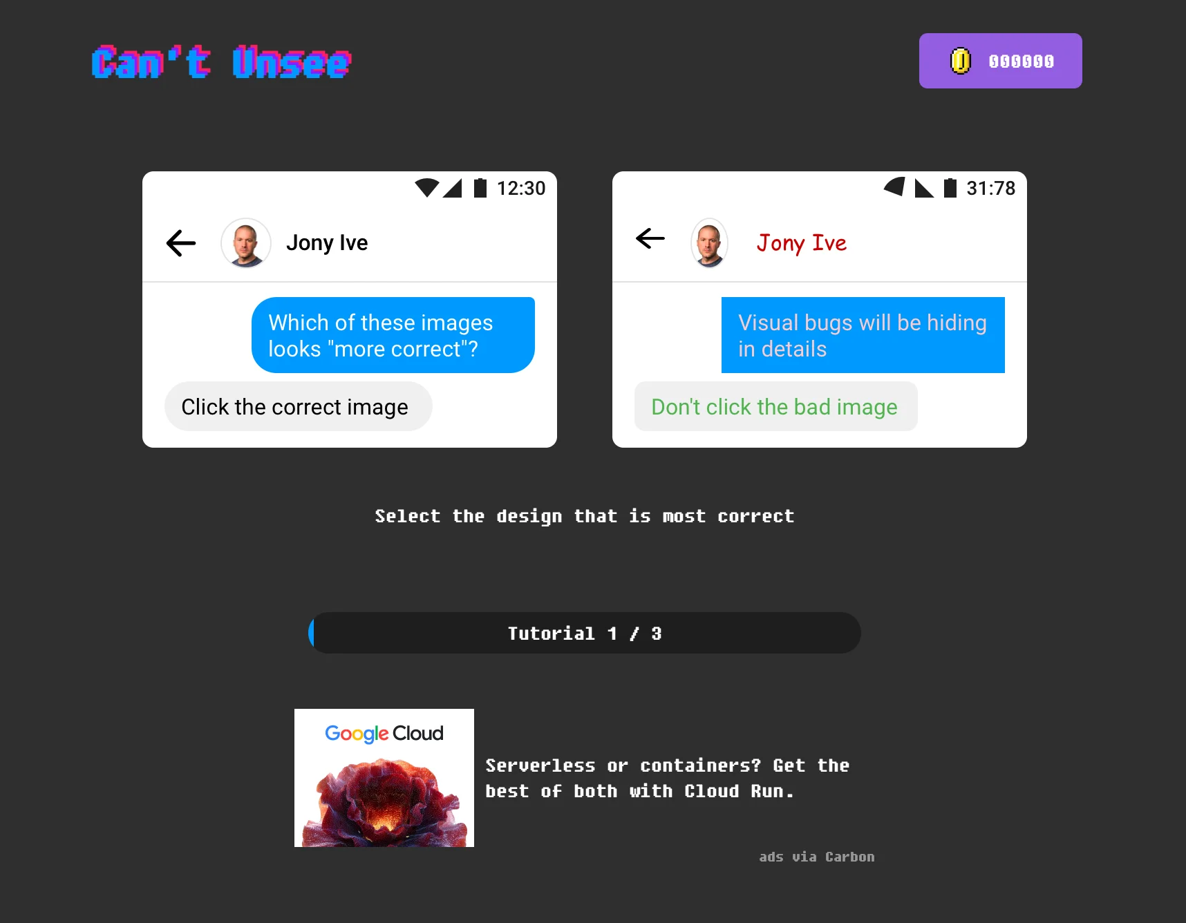
A gamified UI-training tool with a retro arcade aesthetic and a progress bar. Take away: gamification (points, progress, a “win” state) increases time-on-page for educational content.
40. The Web Can Do What!?
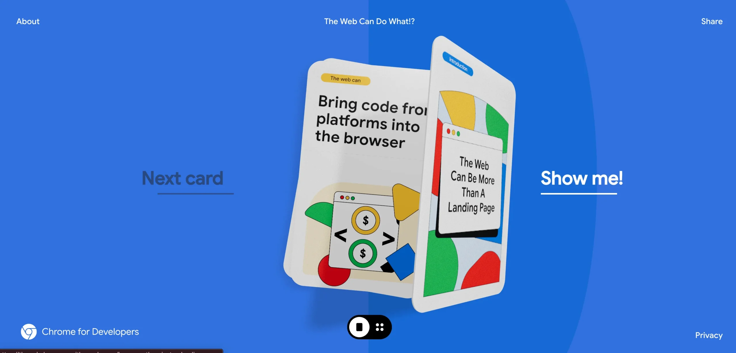
(Google) — Card-based, tactile storytelling that turns “what browsers can do” into a playful flip-card experience. Take away: physical metaphors (cards, flipping, dragging) make abstract technical concepts feel tangible.
Developer tools & infrastructure
41. Vercel
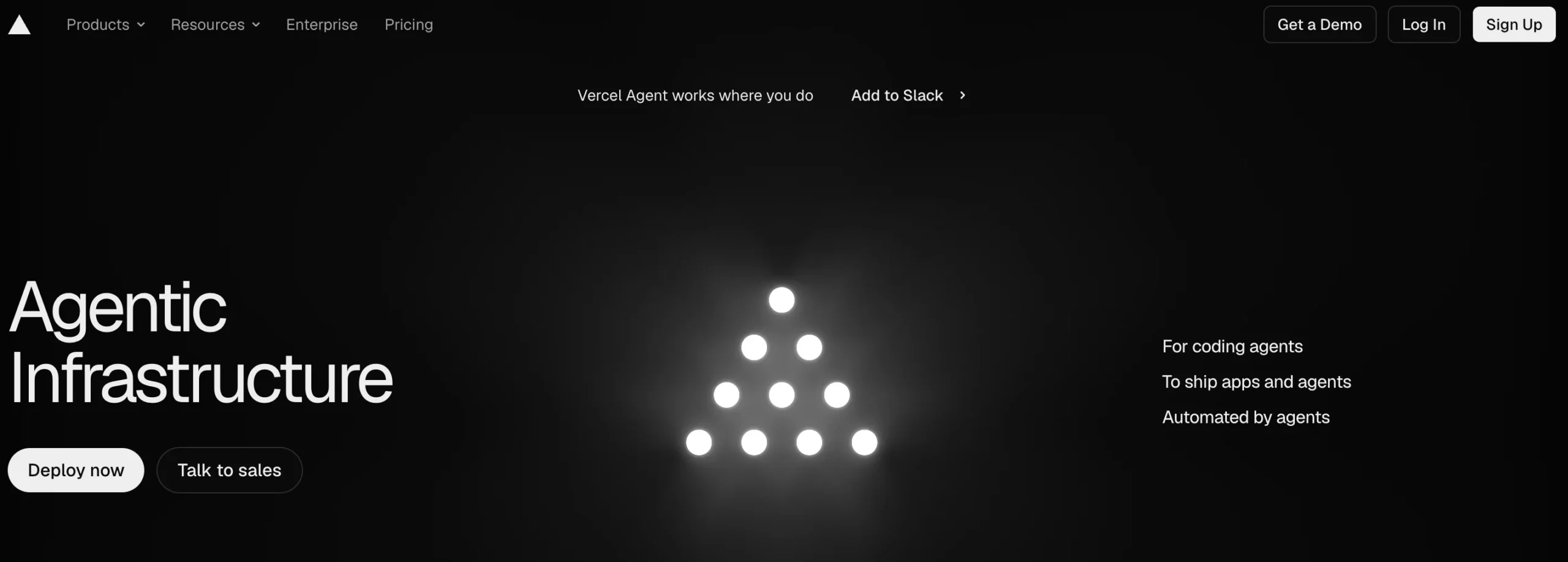
Extremely fast-loading, monochrome, developer-first homepage that mirrors the platform’s own performance promise. Take away: if speed is your pitch, your own site’s load time is your best (or worst) proof point.
42. Raycast
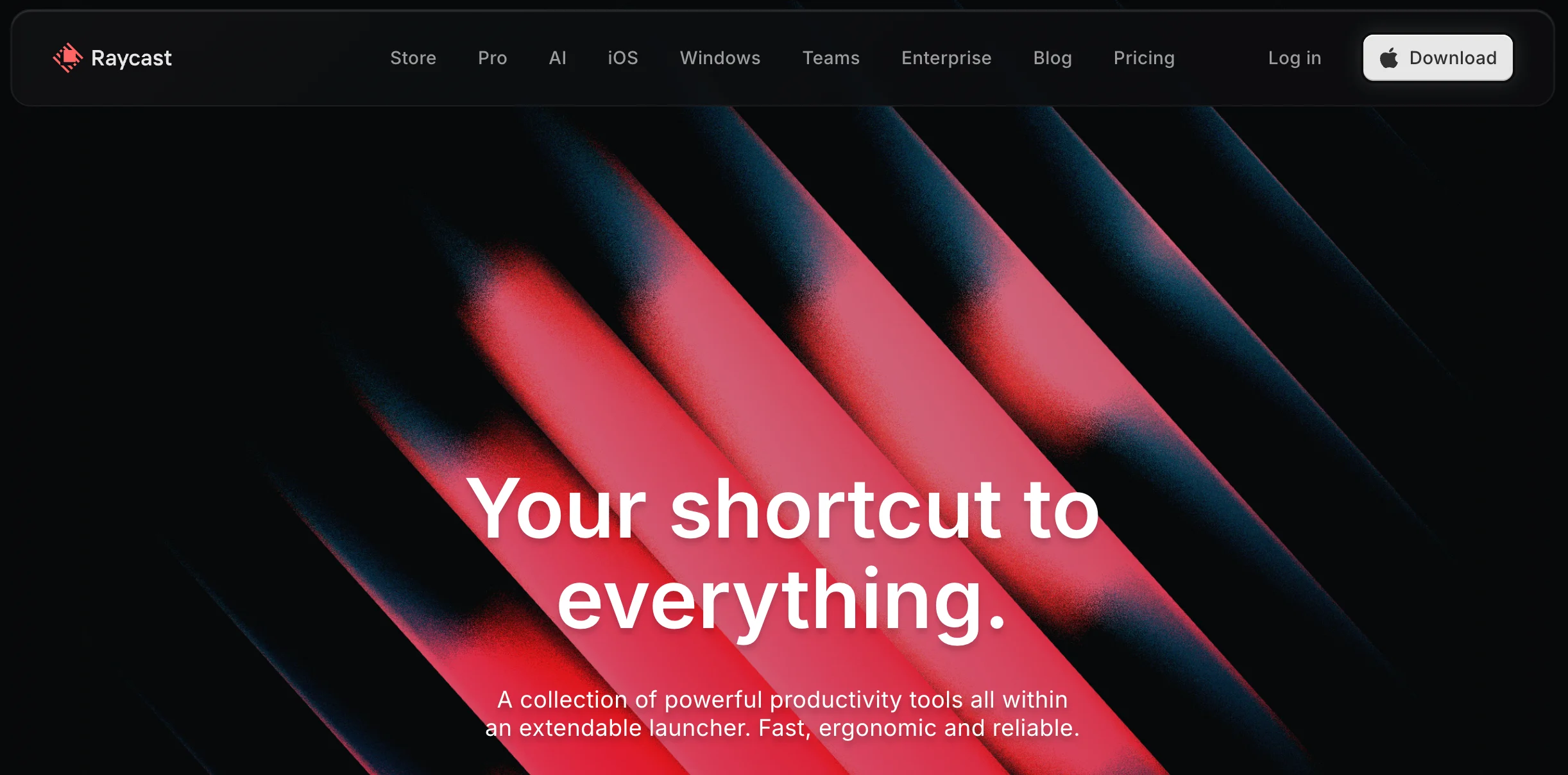
Minimal dark UI with keyboard-shortcut visuals that speak directly to power users. Take away: show the exact interaction pattern (keystrokes, commands) your core user already expects.
43. Arc Browser (The Browser Company)
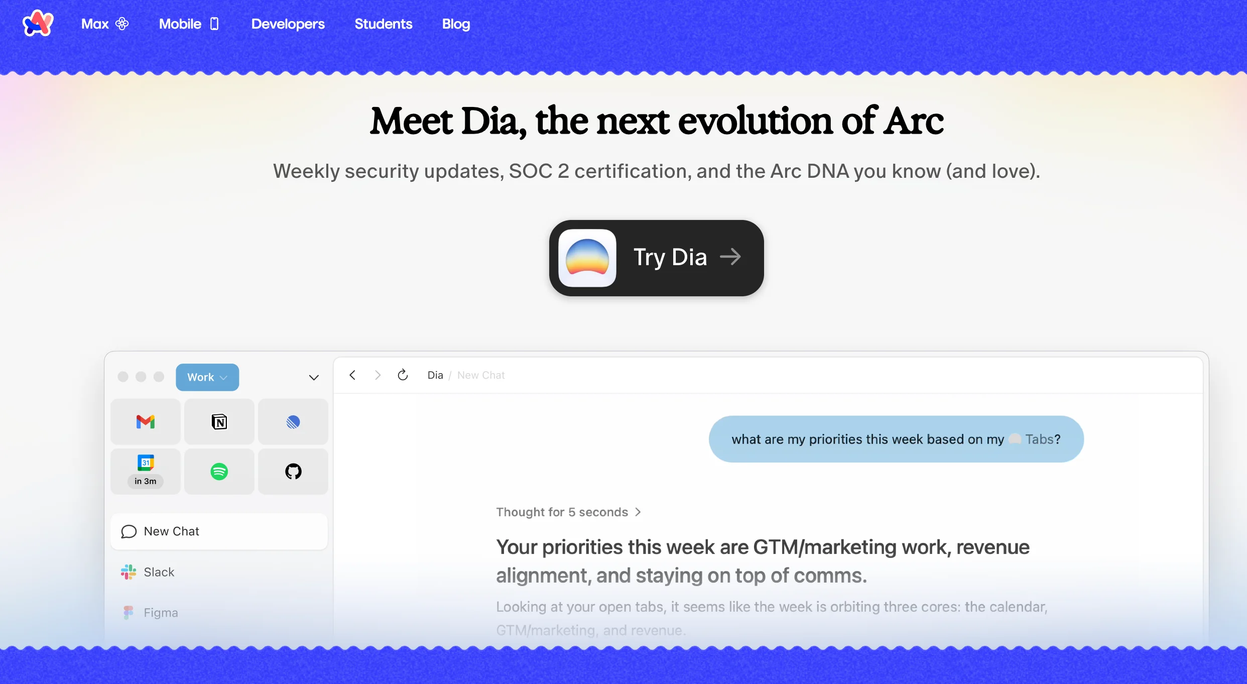
Playful, colorful UI previews paired with confident, conversational copy. Take away: conversational microcopy can make even a technical product (a browser) feel like a lifestyle choice.
44. Fly.io
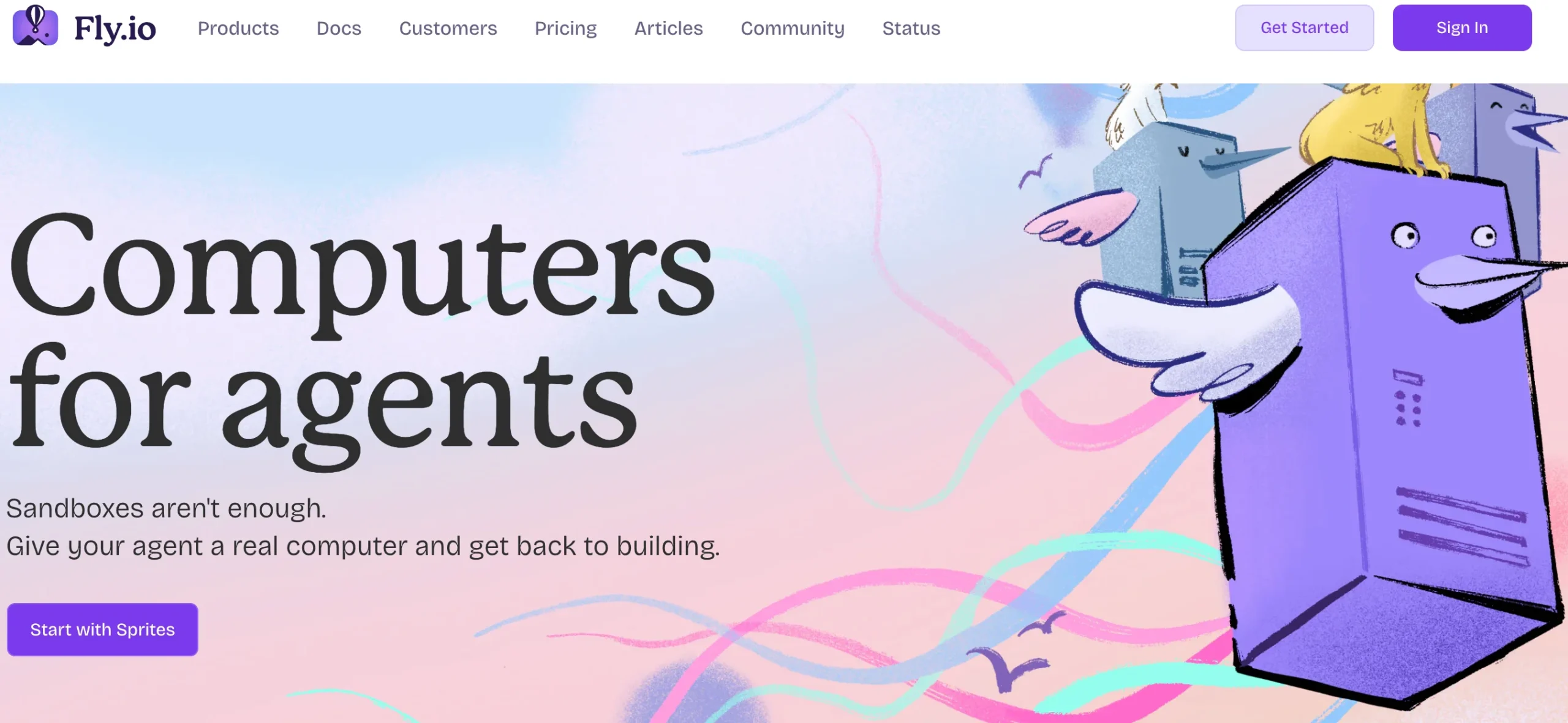
Hand-drawn illustrated skies and balloons soften a technically dense infrastructure pitch. Take away: illustration is one of the cheapest ways to make “boring” infrastructure copy feel approachable.
45. Cursor
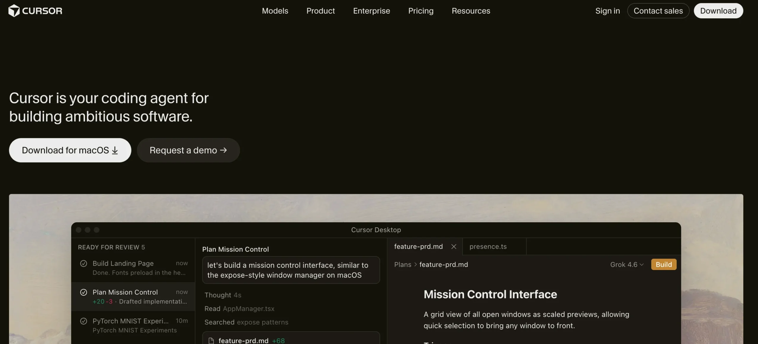
Minimal, code-editor-styled homepage that puts a live coding demo above the fold. Take away: for developer tools, an interactive demo converts better than a features list.
Also Read: How to Choose the Right AI Model for Your Task in 2026 (Without Falling for Benchmark Hype)
Finance, health & services
46. Origin
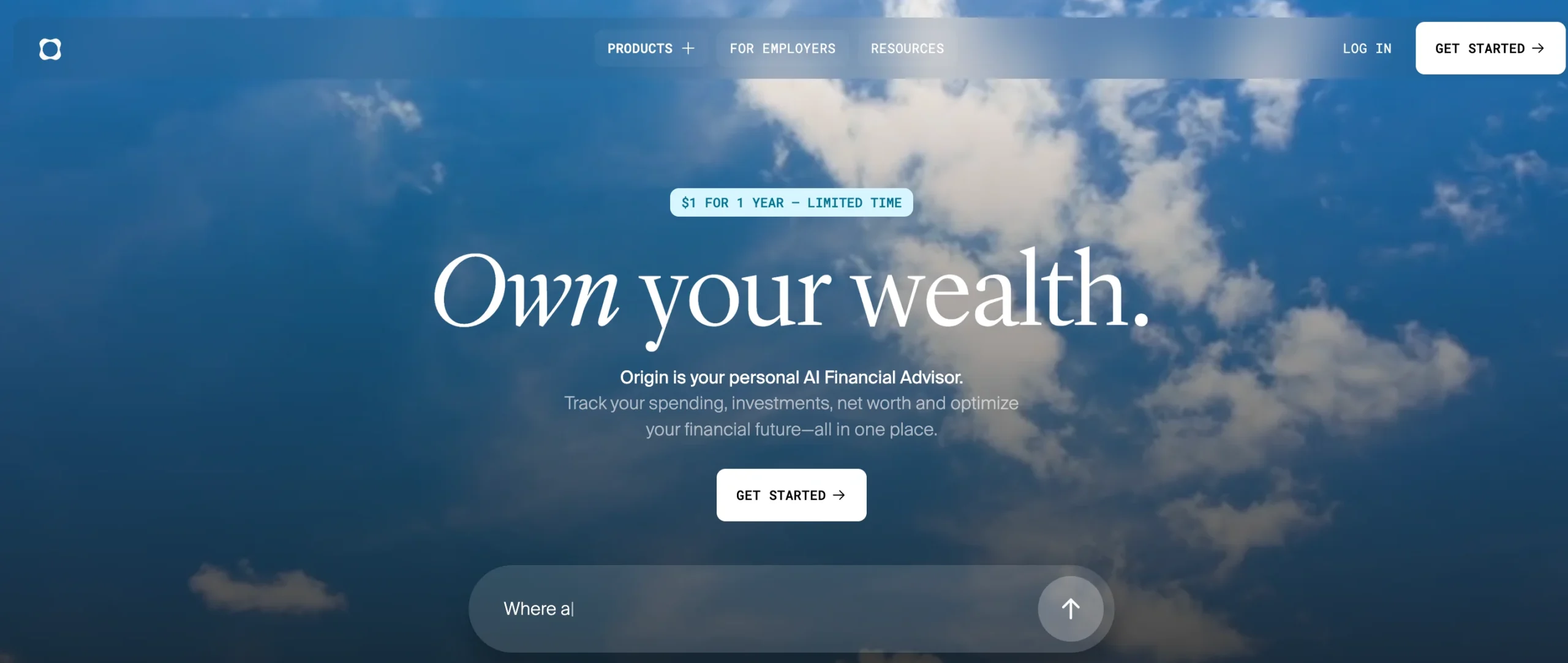
Cinematic sky gradients and glassmorphic cards make personal finance feel calm instead of stressful. Take away: color temperature (cool blues, soft gradients) can directly counteract a category’s natural anxiety.
47. Fluent Health
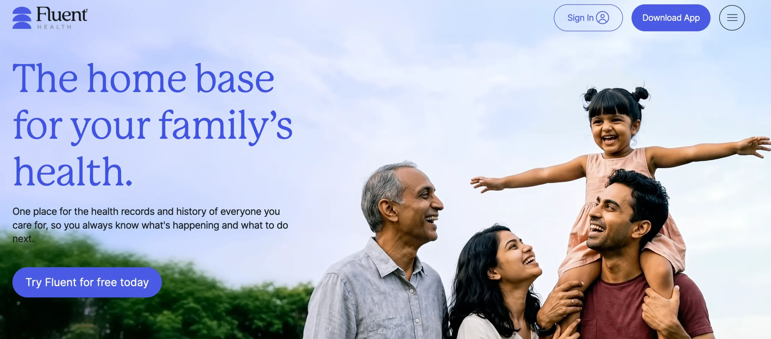
Dark mode with a conversational-UI mockup that mirrors an actual doctor-patient exchange. Take away: showing your product’s real interface as a “conversation” builds instant understanding for AI tools.
48. RobinAI
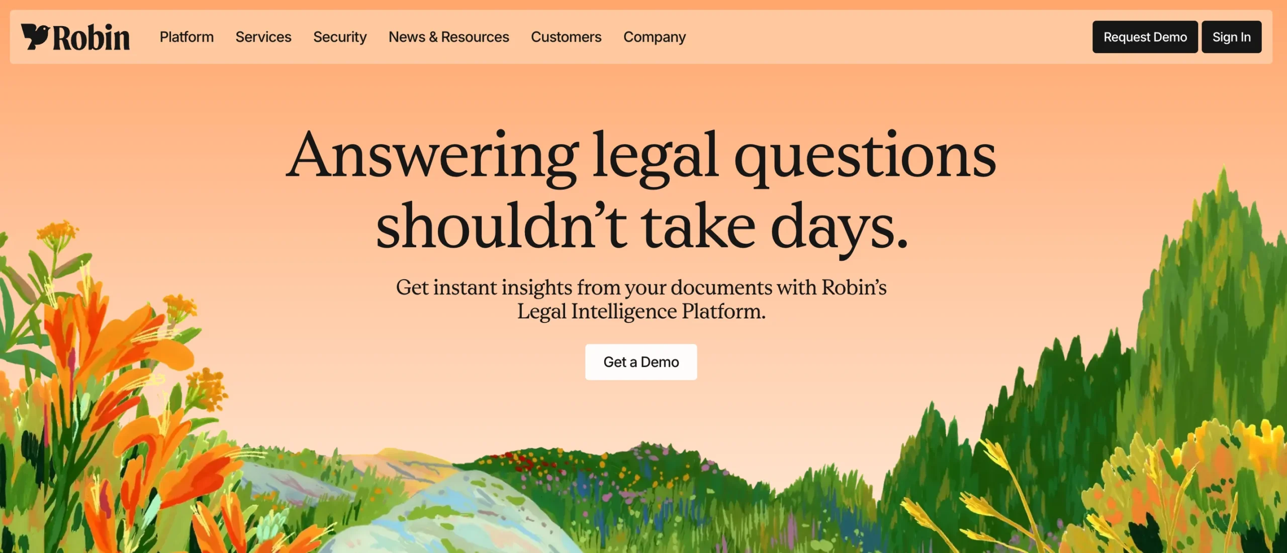
Hand-painted, illustrated landscapes soften a legal-tech product that could otherwise feel intimidating. Take away: warmth in imagery is a fast way to lower the perceived complexity of a “serious” category.
49. Debtfindr
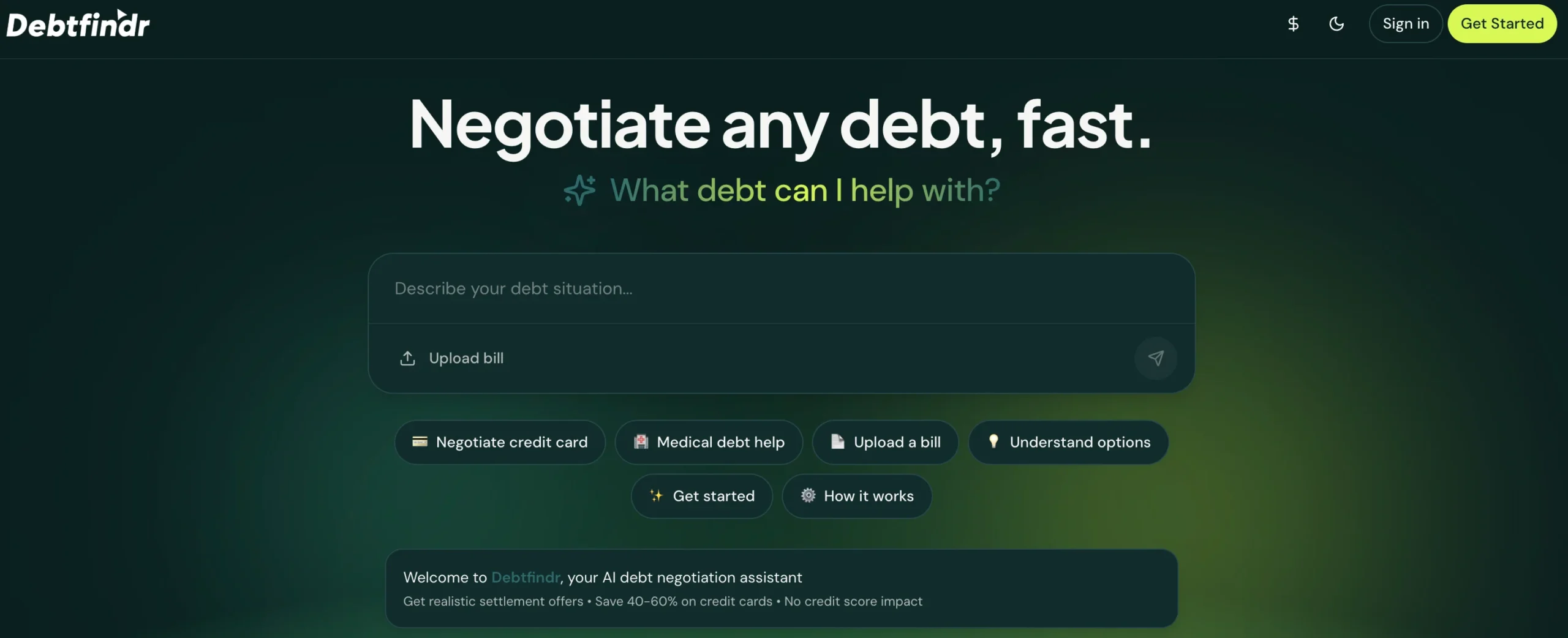
Soft greens and friendly mobile mockups reframe a stressful financial topic as approachable and transparent. Take away: show the exact numbers a user will see post-signup; specificity reduces anxiety more than reassurance copy does.
50. Critter
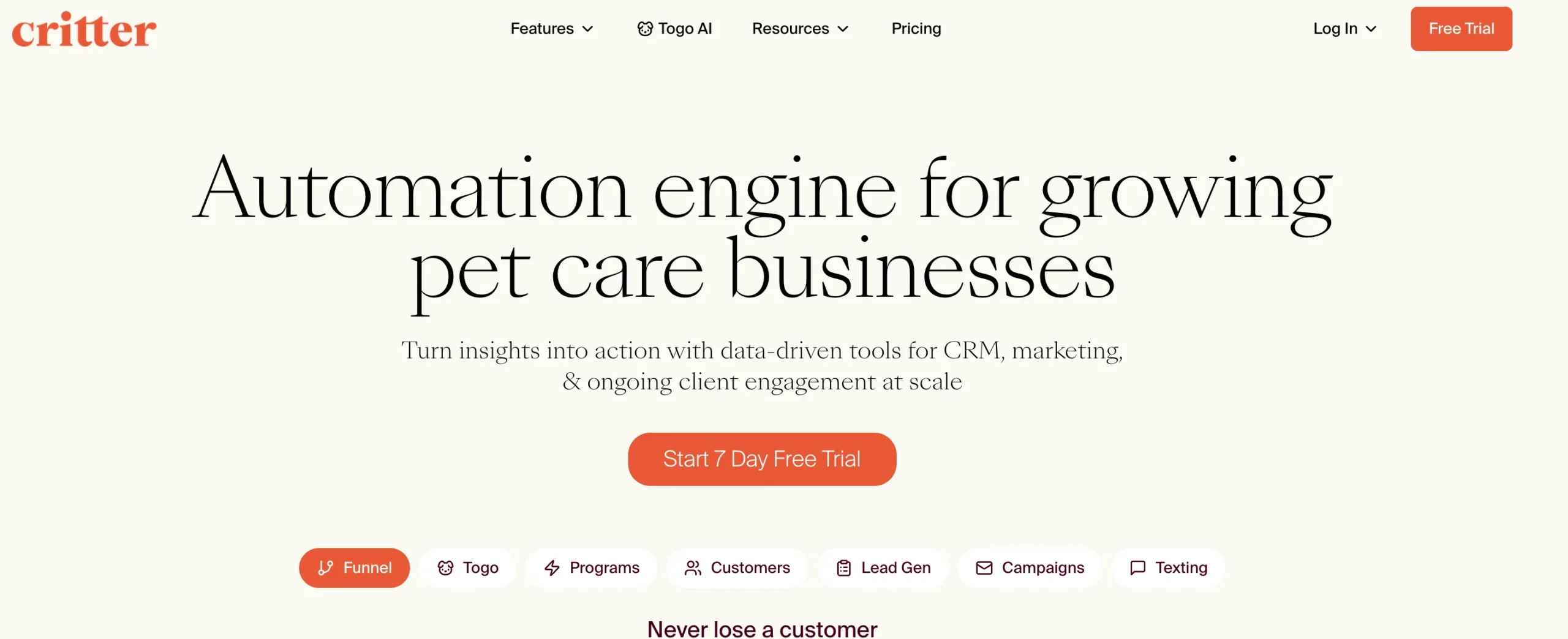
Warm, hand-drawn characters and a floating app preview make pet-care scheduling software feel personal. Take away: character illustration works especially well for services built around trust and care.
Comparison table: which example fits your project?
| Example | Best for | Primary trend | Typical stack |
|---|---|---|---|
| Linear, Stripe, Vercel | B2B SaaS / developer tools | Restraint, real product screenshots | Custom / Next.js |
| Notion, Crisp, Fly.io | Friendly SaaS needing warmth | Illustration-led personality | Webflow / WordPress |
| Cohere, Grok, Neon, Chutes | AI products | Dark UI, gradient, technical motion | Custom / GSAP |
| Lusion, Tiny Wins, Affinity | Creative portfolios/agencies | Immersive visuals, minimal copy | Custom / Three.js |
| Pebble Life, Noon, Gemnote | E-commerce / DTC product | Cinematic photography, product-first | Shopify |
| Origin, Fluent Health, RobinAI | Finance / health / services | Calming palettes, illustrated warmth | WordPress / Webflow |
How to turn any of these examples into your own site (5-step framework)
- Pick one example that matches your category, not your taste. A dark, glowing SaaS aesthetic will feel out of place on a wellness brand, no matter how much you personally like it.
- Extract the structure, not the visuals. Note the order of sections (hero → proof → feature → CTA) before you touch color or type — structure is what actually converts.
- Choose one signature element to borrow. A single technique (a gradient, an illustration style, a comparison table) is more executable — and more original — than copying an entire page.
- Build with the lightest tool that fits your skill level. Framer or Webflow for no-code; Next.js or Astro if you’re comfortable coding; an AI website builder (v0, Framer AI) for a fast first draft you’ll refine by hand.
- Test for the 3-second rule and accessibility before launch. If a first-time visitor can’t tell what the site is for in three seconds, or the contrast fails a WCAG check, fix that before you fix anything decorative.
Conclusion
The best website design examples for 2026 share the same throughline regardless of style: clarity first, personality second, and speed and accessibility non-negotiable. Use the comparison table to find a close match to your project, borrow one signature element rather than a whole template, and run it through the 5-step framework above before you publish.
Frequently Asked Questions
What makes a website design “good” in 2026?
A good website design communicates its purpose within seconds, guides the visitor toward one clear action, and stays fast and accessible across devices — visual style is secondary to that clarity.
What are the 5 golden rules of web design?
1) Keep it simple, 2) maintain a clear visual hierarchy, 3) stay consistent in fonts and color, 4) design for accessibility, 5) make it fully responsive.
What is the 3-second rule in web design?
The 3-second rule holds that visitors decide whether to stay or leave within about three seconds, so your homepage needs to communicate what the site is, who it’s for, and what to do next almost instantly.
Do I need to follow design trends to make a good website?
No — trends like heavy motion or specific gradients can inspire, but a clear, consistent, brand-aligned design will outperform a trendy one over time.
What’s the difference between UI and UX design?
UI (user interface) design covers the visual elements — color, typography, buttons — while UX (user experience) design covers how the whole journey feels and functions, including navigation and flow.
Can I use an AI website builder instead of hiring a designer?
AI builders like Framer AI or v0 are strong for a fast first draft or a simple site, but most businesses still benefit from a human designer’s judgment on hierarchy, brand voice, and edge cases once the stakes (revenue, credibility) rise.
How much does a professionally designed website cost in 2026?
Costs vary widely: a freelancer might charge a few thousand dollars for a small marketing site, while an agency-built SaaS or e-commerce site can run into the tens of thousands — templates and no-code builders sit far below both.
Where can I find more website design inspiration beyond this list?
Awwwards and Dribbble are the two largest curated galleries for ongoing inspiration; both are best used after you’ve picked a structural direction from a list like this one, so you’re browsing with a filter rather than browsing at random.


Add a Comment